 buttonpanel
A custom panel class with gradient background shading with the possibility to add buttons and controls still respecting the gradient background.
 Description
With ButtonPanel class you have a panel with gradient colouring on it and with the possibility to place some buttons on it. Using a standard panel with normal wx.Buttons leads to an ugly result: the buttons are placed correctly on the panel - but with grey area around them. Gradient colouring is kept behind the images - this was achieved due to the PNG format and the transparency of the bitmaps.
The image are functioning like a buttons and can be caught in your code using the usual:
self.Bind(wx.EVT_BUTTON, self.OnButton)
method.
The control is generic, and support theming (well, I tested it under Windows with the three defauls themes: grey, blue, silver and the classic look).
 Usage
ButtonPanel supports 4 alignments: left, right, top, bottom, which have a different meaning and behavior with respect to wx.Toolbar. The easiest thing is to try the demo to understand, but I’ll try to explain how it works.
CASE 1: ButtonPanel has a main caption text.
CASE 2: ButtonPanel has no main caption text.
Usage example:
import wx
import wx.lib.agw.buttonpanel as BP

class MyFrame(wx.Frame):

    def __init__(self, parent, id=-1, title="ButtonPanel", pos=wx.DefaultPosition,
                 size=(800, 600), style=wx.DEFAULT_FRAME_STYLE):

        wx.Frame.__init__(self, parent, id, title, pos, size, style)

        mainPanel = wx.Panel(self, -1)
        self.logtext = wx.TextCtrl(mainPanel, -1, "", style=wx.TE_MULTILINE)

        vSizer = wx.BoxSizer(wx.VERTICAL)
        mainPanel.SetSizer(vSizer)

        titleBar = BP.ButtonPanel(mainPanel, -1, "A Simple Test & Demo")

        btn1 = BP.ButtonInfo(titleBar, wx.NewId(), wx.Bitmap("png4.png", wx.BITMAP_TYPE_PNG))
        titleBar.AddButton(btn1)
        self.Bind(wx.EVT_BUTTON, self.OnButton, btn1)

        btn2 = BP.ButtonInfo(titleBar, wx.NewId(), wx.Bitmap("png3.png", wx.BITMAP_TYPE_PNG))
        titleBar.AddButton(btn2)
        self.Bind(wx.EVT_BUTTON, self.OnButton, btn2)

        btn3 = BP.ButtonInfo(titleBar, wx.NewId(), wx.Bitmap("png2.png", wx.BITMAP_TYPE_PNG))
        titleBar.AddButton(btn3)
        self.Bind(wx.EVT_BUTTON, self.OnButton, btn3)

        btn4 = BP.ButtonInfo(titleBar, wx.NewId(), wx.Bitmap("png1.png", wx.BITMAP_TYPE_PNG))
        titleBar.AddButton(btn4)
        self.Bind(wx.EVT_BUTTON, self.OnButton, btn4)

        vSizer.Add(titleBar, 0, wx.EXPAND)
        vSizer.Add((20, 20))
        vSizer.Add(self.logtext, 1, wx.EXPAND|wx.ALL, 5)

        titleBar.DoLayout()
        vSizer.Layout()


    def OnButton(self, event):
        ''' Handler for the ``wx.EVT_BUTTON`` event. '''

        obj = event.GetEventObject()

        # This will print the button label
        print obj.GetText()


# our normal wxApp-derived class, as usual

app = wx.PySimpleApp()

frame = MyFrame(None)
app.SetTopWindow(frame)
frame.Show()

app.MainLoop()
This code snippet can be downloaded, see this example script.
Note
Some of the AGW snippets of code in the documentation use images and external files (to create bitmaps or access external data). As these files are not provided in these snippets, you should make the approriate modifications to the code to actually run it.
 Window Styles
This class supports the following window styles:
| Window Styles | Hex Value | Description |
|---|---|---|
| BP_DEFAULT_STYLE | 0x1 | ButtonPanel has a plain solid background. |
| BP_USE_GRADIENT | 0x2 | ButtonPanel has a gradient shading background. |
 Events Processing
This class processes the following events:
| Event Name | Description |
|---|---|
| wx.EVT_BUTTON | Process a wx.wxEVT_COMMAND_BUTTON_CLICKED event, when a button is clicked. |
 License And Version
ButtonPanel is distributed under the wxPython license.
Latest Revision: Andrea Gavana @ 17 Aug 2011, 15.00 GMT
Version 0.6.
Module author: Andrea Gavana <andrea.gavana@gmail.com>
 SVN Revisions
A graphical representation of the SVN commits in the last year.
Click on any date in the picture to jump to that particular revision page, containing information about committers, log messages and SVN diffs.
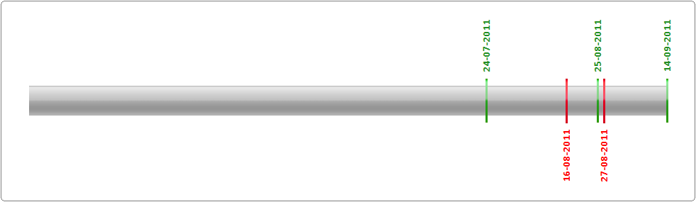
Revision Graph For buttonpanel
 Class Summary
 Inheritance Diagram
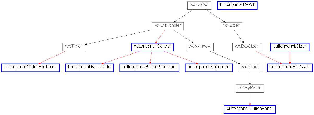
 Python 3 Issues (via 2to3)
 Function Summary