 customtreectrl
CustomTreeCtrl is a class that mimics the behaviour of wx.TreeCtrl, with some more enhancements.
 Description
CustomTreeCtrl is a class that mimics the behaviour of wx.TreeCtrl, with almost the same base functionalities plus some more enhancements. This class does not rely on the native control, as it is a full owner-drawn tree control. Apart of the base functionalities of CustomTreeCtrl (described below), in addition to the standard wx.TreeCtrl behaviour this class supports:
And a lot more. Check the demo for an almost complete review of the functionalities.
 Base Functionalities
CustomTreeCtrl supports all the wx.TreeCtrl styles, except:
Plus it has 3 more styles to handle checkbox-type items:
And two styles you can use to force the horizontal alignment of all the widgets attached to the tree items:
And two styles related to long items (with a lot of text in them), which can be ellipsized and/or highlighted with a tooltip:
All the methods available in wx.TreeCtrl are also available in CustomTreeCtrl.
 Usage
Usage example:
import wx
import wx.lib.agw.customtreectrl as CT

class MyFrame(wx.Frame):

    def __init__(self, parent):

        wx.Frame.__init(self, parent, -1, "CustomTreeCtrl Demo")

        # Create a CustomTreeCtrl instance
        custom_tree = CT.CustomTreeCtrl(self, agwStyle=wx.TR_DEFAULT_STYLE)

        # Add a root node to it
        root = custom_tree.AddRoot("The Root Item")

        # Create an image list to add icons next to an item
        il = wx.ImageList(16, 16)
        fldridx     = il.Add(wx.ArtProvider_GetBitmap(wx.ART_FOLDER,      wx.ART_OTHER, 16))
        fldropenidx = il.Add(wx.ArtProvider_GetBitmap(wx.ART_FILE_OPEN,   wx.ART_OTHER, 16))
        fileidx     = il.Add(wx.ArtProvider_GetBitmap(wx.ART_NORMAL_FILE, wx.ART_OTHER, 16))

        custom_tree.SetImageList(il)

        custom_tree.SetItemImage(root, fldridx, wx.TreeItemIcon_Normal)
        custom_tree.SetItemImage(root, fldropenidx, wx.TreeItemIcon_Expanded)

        for x in range(15):
            child = custom_tree.AppendItem(root, "Item %d" % x)
            custom_tree.SetItemImage(child, fldridx, wx.TreeItemIcon_Normal)
            custom_tree.SetItemImage(child, fldropenidx, wx.TreeItemIcon_Expanded)

            for y in range(5):
                last = custom_tree.AppendItem(child, "item %d-%s" % (x, chr(ord("a")+y)))
                custom_tree.SetItemImage(last, fldridx, wx.TreeItemIcon_Normal)
                custom_tree.SetItemImage(last, fldropenidx, wx.TreeItemIcon_Expanded)

                for z in range(5):
                    item = custom_tree.AppendItem(last,  "item %d-%s-%d" % (x, chr(ord("a")+y), z))
                    custom_tree.SetItemImage(item, fileidx, wx.TreeItemIcon_Normal)
                    custom_tree.SetItemImage(item, smileidx, wx.TreeItemIcon_Selected)

        custom_tree.Expand(self.root)


# our normal wxApp-derived class, as usual

app = wx.PySimpleApp()

frame = MyFrame(None)
app.SetTopWindow(frame)
frame.Show()

app.MainLoop()
This code snippet can be downloaded, see this example script.
Note
Some of the AGW snippets of code in the documentation use images and external files (to create bitmaps or access external data). As these files are not provided in these snippets, you should make the approriate modifications to the code to actually run it.
 Events
All the events supported by wx.TreeCtrl are also available in CustomTreeCtrl, with a few exceptions:
Plus, CustomTreeCtrl supports the events related to the checkbutton-type items:
And to hyperlink-type items:
 Supported Platforms
 Window Styles
This class supports the following window styles:
| Window Styles | Hex Value | Description |
|---|---|---|
| TR_NO_BUTTONS | 0x0 | For convenience to document that no buttons are to be drawn. |
| TR_SINGLE | 0x0 | For convenience to document that only one item may be selected at a time. Selecting another item causes the current selection, if any, to be deselected. This is the default. |
| TR_HAS_BUTTONS | 0x1 | Use this style to show + and - buttons to the left of parent items. |
| TR_NO_LINES | 0x4 | Use this style to hide vertical level connectors. |
| TR_LINES_AT_ROOT | 0x8 | Use this style to show lines between root nodes. Only applicable if TR_HIDE_ROOT is set and TR_NO_LINES is not set. |
| TR_DEFAULT_STYLE | 0x9 | The set of flags that are closest to the defaults for the native control for a particular toolkit. |
| TR_TWIST_BUTTONS | 0x10 | Use old Mac-twist style buttons. |
| TR_MULTIPLE | 0x20 | Use this style to allow a range of items to be selected. If a second range is selected, the current range, if any, is deselected. |
| TR_EXTENDED | 0x40 | Use this style to allow disjoint items to be selected. (Only partially implemented; may not work in all cases). |
| TR_HAS_VARIABLE_ROW_HEIGHT | 0x80 | Use this style to cause row heights to be just big enough to fit the content. If not set, all rows use the largest row height. The default is that this flag is unset. |
| TR_EDIT_LABELS | 0x200 | Use this style if you wish the user to be able to edit labels in the tree control. |
| TR_ROW_LINES | 0x400 | Use this style to draw a contrasting border between displayed rows. |
| TR_HIDE_ROOT | 0x800 | Use this style to suppress the display of the root node, effectively causing the first-level nodes to appear as a series of root nodes. |
| TR_FULL_ROW_HIGHLIGHT | 0x2000 | Use this style to have the background colour and the selection highlight extend over the entire horizontal row of the tree control window. |
| TR_AUTO_CHECK_CHILD | 0x4000 | Only meaningful foe checkbox-type items: when a parent item is checked/unchecked its children are checked/unchecked as well. |
| TR_AUTO_TOGGLE_CHILD | 0x8000 | Only meaningful foe checkbox-type items: when a parent item is checked/unchecked its children are toggled accordingly. |
| TR_AUTO_CHECK_PARENT | 0x10000 | Only meaningful foe checkbox-type items: when a child item is checked/unchecked its parent item is checked/unchecked as well. |
| TR_ALIGN_WINDOWS | 0x20000 | Flag used to align windows (in items with windows) at the same horizontal position. |
| TR_ALIGN_WINDOWS_RIGHT | 0x40000 | Flag used to align windows (in items with windows) to the rightmost edge of CustomTreeCtrl. |
| TR_ELLIPSIZE_LONG_ITEMS | 0x80000 | Flag used to ellipsize long items when the horizontal space for CustomTreeCtrl is low. |
| TR_TOOLTIP_ON_LONG_ITEMS | 0x100000 | Flag used to show tooltips on long items when the horizontal space for CustomTreeCtrl is low. |
Events Processing¶This class processes the following events:
| Event Name | Description |
|---|---|
| EVT_TREE_BEGIN_DRAG | Begin dragging with the left mouse button. |
| EVT_TREE_BEGIN_LABEL_EDIT | Begin editing a label. This can be prevented by calling Veto. |
| EVT_TREE_BEGIN_RDRAG | Begin dragging with the right mouse button. |
| EVT_TREE_DELETE_ITEM | Delete an item. |
| EVT_TREE_END_DRAG | End dragging with the left or right mouse button. |
| EVT_TREE_END_LABEL_EDIT | End editing a label. This can be prevented by calling Veto. |
| EVT_TREE_GET_INFO | Request information from the application (not implemented in CustomTreeCtrl). |
| EVT_TREE_ITEM_ACTIVATED | The item has been activated, i.e. chosen by double clicking it with mouse or from keyboard. |
| EVT_TREE_ITEM_CHECKED | A checkbox or radiobox type item has been checked. |
| EVT_TREE_ITEM_CHECKING | A checkbox or radiobox type item is being checked. |
| EVT_TREE_ITEM_COLLAPSED | The item has been collapsed. |
| EVT_TREE_ITEM_COLLAPSING | The item is being collapsed. This can be prevented by calling Veto. |
| EVT_TREE_ITEM_EXPANDED | The item has been expanded. |
| EVT_TREE_ITEM_EXPANDING | The item is being expanded. This can be prevented by calling Veto. |
| EVT_TREE_ITEM_GETTOOLTIP | The opportunity to set the item tooltip is being given to the application (call TreeEvent.SetToolTip). |
| EVT_TREE_ITEM_HYPERLINK | An hyperlink type item has been clicked. |
| EVT_TREE_ITEM_MENU | The context menu for the selected item has been requested, either by a right click or by using the menu key. |
| EVT_TREE_ITEM_MIDDLE_CLICK | The user has clicked the item with the middle mouse button (not implemented in CustomTreeCtrl). |
| EVT_TREE_ITEM_RIGHT_CLICK | The user has clicked the item with the right mouse button. |
| EVT_TREE_KEY_DOWN | A key has been pressed. |
| EVT_TREE_SEL_CHANGED | Selection has changed. |
| EVT_TREE_SEL_CHANGING | Selection is changing. This can be prevented by calling Veto. |
| EVT_TREE_SET_INFO | Information is being supplied to the application (not implemented in CustomTreeCtrl). |
| EVT_TREE_STATE_IMAGE_CLICK | The state image has been clicked (not implemented in CustomTreeCtrl). |
 License And Version
CustomTreeCtrl is distributed under the wxPython license.
Latest Revision: Andrea Gavana @ 10 Mar 2012, 21.00 GMT
Version 2.6
Module author: Andrea Gavana <andrea.gavana@gmail.com>
 SVN Revisions
A graphical representation of the SVN commits in the last year.
Click on any date in the picture to jump to that particular revision page, containing information about committers, log messages and SVN diffs.
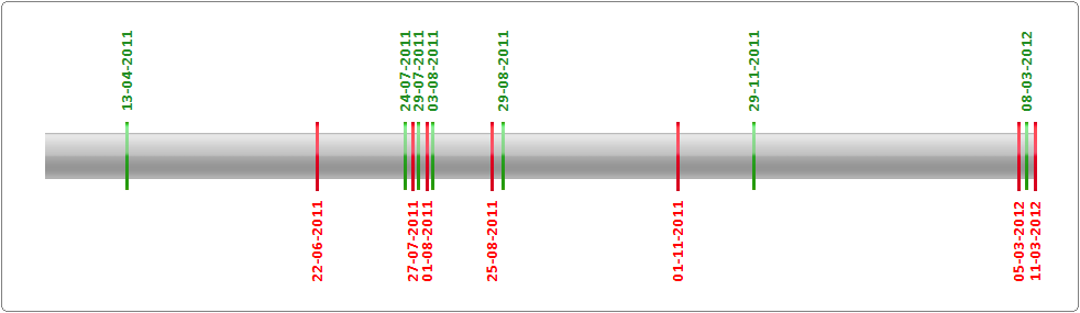
Revision Graph For customtreectrl
 Class Summary
 Inheritance Diagram
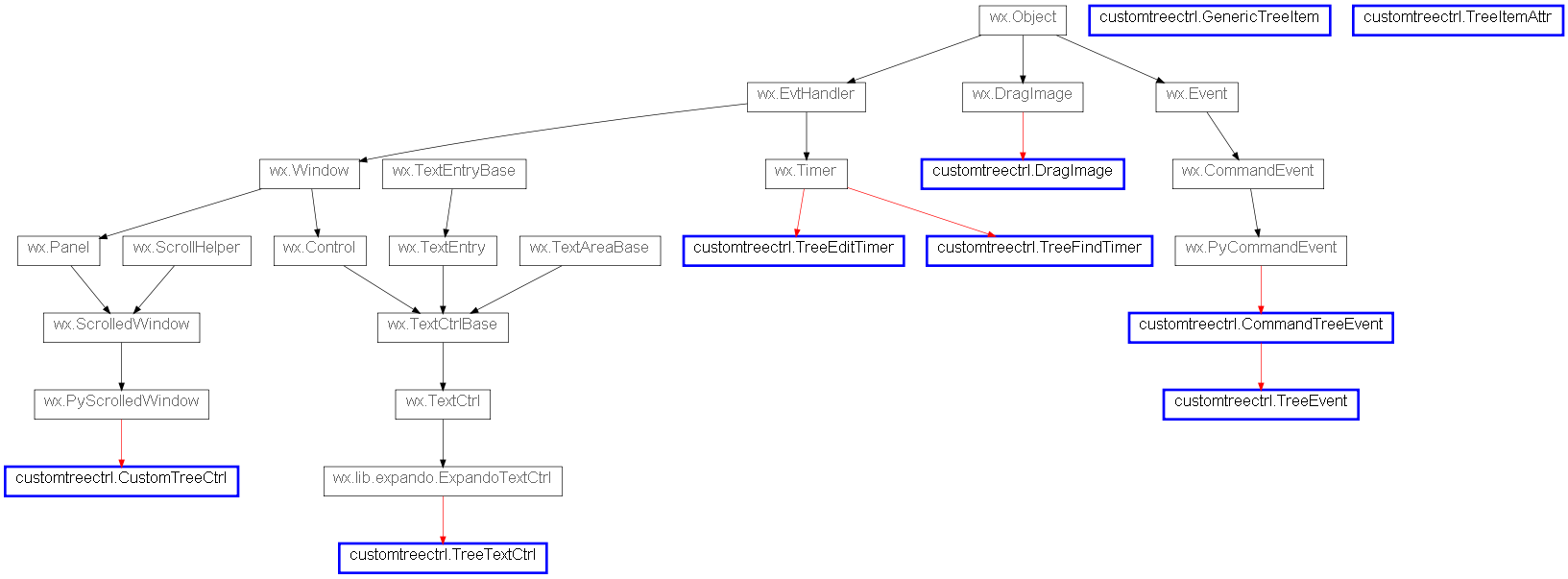
 Python 3 Issues (via 2to3)
 Function Summary