Inheritance diagram for wx.CheckBox:

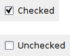
A checkbox is a labelled box which by default is either on (checkmark is visible) or off (no checkmark). Optionally (when the wx.CHK_3STATE style flag is set) it can have a third state, called the mixed or undetermined state. Often this is used as a “Does Not Apply” state.
See also
| Window Style | Description |
|---|---|
| wx.CHK_2STATE | Create a 2-state checkbox. This is the default. |
| wx.CHK_3STATE | Create a 3-state checkbox. Not implemented in wxMGL, wxOS2 and wxGTK built against GTK+ 1.2. |
| wx.CHK_ALLOW_3RD_STATE_FOR_USER | By default a user can’t set a 3-state checkbox to the third state. It can only be done from code. Using this flags allows the user to set the checkbox to the third state by clicking. |
| wx.ALIGN_RIGHT | Makes the text appear on the left of the checkbox. |
| Event Name | Description |
|---|---|
| wx.EVT_CHECKBOX(id, func) | Process a wx.wxEVT_COMMAND_CHECKBOX_CLICKED event, when the checkbox is clicked. |
Creates and shows a wx.CheckBox control.
Parameters:
Returns:
Gets the state of a 3-state checkbox.
Returns:
int
Gets the state of a 2-state checkbox.
Returns:
bool
Returns whether or not the checkbox is a 3-state checkbox.
Returns:
bool
Returns whether or not the user can set the checkbox to the third state.
Returns:
bool
This is just a maybe more readable synonym for GetValue: just as the latter, it returns True if the checkbox is checked and False otherwise.
Returns:
bool
Sets the CheckBox to the given state. The state parameter can be one of the following:
Raises an exception when the CheckBox is a 2-state checkbox and setting the state to wx.CHK_UNDETERMINED.
Parameters:
Sets the checkbox to the given state. This does not cause a wx.wxEVT_COMMAND_CHECKBOX_CLICKED event to get emitted.
Parameters: