Inheritance diagram for wx.ListCtrl:

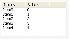
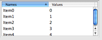
A list control presents lists in a number of formats: list view, report view, icon view and small icon view. In any case, elements are numbered from zero. For all these modes, the items are stored in the control and must be added to it using InsertItem method.
A special case of report view quite different from the other modes of the list control is a virtual control in which the items data (including text, images and attributes) is managed by the main program and is requested by the control itself only when needed which allows to have controls with millions of items without consuming much memory. To use virtual list control you must use SetItemCount first and overload at least OnGetItemText (and optionally OnGetItemImage or OnGetItemColumnImage and OnGetItemAttr to return the information about the items when the control requests it. Virtual list control can be used as a normal one except that no operations which can take time proportional to the number of items in the control happen – this is required to allow having a practically infinite number of items. For example, in a multiple selection virtual list control, the selections won’t be sent when many items are selected at once because this could mean iterating over all the items.
To intercept events from a list control, use the event table macros described in wx.ListEvent.
Note
Mac Note: Starting with 2.8, wx.ListCtrl uses a native implementation for report mode, and uses a generic implementation for other modes. You can use the generic implementation for report mode as well by setting the mac.listctrl.always_use_generic wx.SystemOption to 1.
See also
wx.ListView, wx.ListBox, wx.TreeCtrl, wx.ImageList, wx.ListEvent, wx.ListItem
| Window Style | Description |
|---|---|
| wx.LC_LIST | Multicolumn list view, with optional small icons. Columns are computed automatically, i.e. you don’t set columns as in wx.LC_REPORT. In other words, the list wraps, unlike a wx.ListBox. |
| wx.LC_REPORT | Single or multicolumn report view, with optional header. |
| wx.LC_VIRTUAL | The application provides items text on demand. May only be used with wx.LC_REPORT. |
| wx.LC_ICON | Large icon view, with optional labels. |
| wx.LC_SMALL_ICON | Small icon view, with optional labels. |
| wx.LC_ALIGN_TOP | Icons align to the top. Win32 default, Win32 only. |
| wx.LC_ALIGN_LEFT | Icons align to the left. |
| wx.LC_AUTOARRANGE | Icons arrange themselves. Win32 only. |
| wx.LC_EDIT_LABELS | Labels are editable: the application will be notified when editing starts. |
| wx.LC_NO_HEADER | No header in report mode. |
| wx.LC_SINGLE_SEL | Single selection (default is multiple). |
| wx.LC_SORT_ASCENDING | Sort in ascending order (must still supply a comparison callback in SortItems. |
| wx.LC_SORT_DESCENDING | Sort in descending order (must still supply a comparison callback in SortItems. |
| wx.LC_HRULES | Draws light horizontal rules between rows in report mode. |
| wx.LC_VRULES | Draws light vertical rules between columns in report mode. |
| Event Name | Description |
|---|---|
| wx.EVT_LIST_BEGIN_DRAG(id, func) | Begin dragging with the left mouse button. |
| wx.EVT_LIST_BEGIN_RDRAG(id, func) | Begin dragging with the right mouse button. |
| wx.EVT_LIST_BEGIN_LABEL_EDIT(id, func) | Begin editing a label. This can be prevented by calling Veto. |
| wx.EVT_LIST_END_LABEL_EDIT(id, func) | Finish editing a label. This can be prevented by calling Veto. |
| wx.EVT_LIST_DELETE_ITEM(id, func) | Delete an item. |
| wx.EVT_LIST_DELETE_ALL_ITEMS(id, func) | Delete all items. |
| wx.EVT_LIST_ITEM_SELECTED(id, func) | The item has been selected. |
| wx.EVT_LIST_ITEM_DESELECTED(id, func) | The item has been deselected. |
| wx.EVT_LIST_ITEM_ACTIVATED(id, func) | The item has been activated (ENTER or double click). |
| wx.EVT_LIST_ITEM_FOCUSED(id, func) | The currently focused item has changed. |
| wx.EVT_LIST_ITEM_MIDDLE_CLICK(id, func) | The middle mouse button has been clicked on an item. |
| wx.EVT_LIST_ITEM_RIGHT_CLICK(id, func) | The right mouse button has been clicked on an item. |
| wx.EVT_LIST_KEY_DOWN(id, func) | A key has been pressed. |
| wx.EVT_LIST_INSERT_ITEM(id, func) | An item has been inserted. |
| wx.EVT_LIST_COL_CLICK(id, func) | A column has been left-clicked. |
| wx.EVT_LIST_COL_RIGHT_CLICK(id, func) | A column has been right-clicked. |
| wx.EVT_LIST_COL_BEGIN_DRAG(id, func) | The user started resizing a column - can be vetoed. |
| wx.EVT_LIST_COL_DRAGGING(id, func) | The divider between columns is being dragged. |
| wx.EVT_LIST_COL_END_DRAG(id, func) | A column has been resized by the user. |
| wx.EVT_LIST_CACHE_HINT(id, func) | Prepare cache for a list control |
Constructor.
Parameters:
Returns:
Append an item to the list control. The entry parameter should be a sequence with an item for each column
Parameters:
Arranges the items in icon or small icon view. This only has effect on Win32. flag is one of:
| Alignment Flags | Description |
|---|---|
| wx.LIST_ALIGN_DEFAULT | Default alignment. |
| wx.LIST_ALIGN_LEFT | Align to the left side of the control. |
| wx.LIST_ALIGN_TOP | Align to the top side of the control. |
| wx.LIST_ALIGN_SNAP_TO_GRID | Snap to grid. |
Parameters:
Returns:
bool
Sets the image list associated with the control and takes ownership of it (i.e. the control will, unlike when using SetImageList, delete the list when destroyed). which is one of wx.IMAGE_LIST_NORMAL, wx.IMAGE_LIST_SMALL, wx.IMAGE_LIST_STATE (the last is unimplemented).
Parameters:
See also
Parameters:
Deletes all items in the list control.
Returns:
bool
Note
This function does not send the wx.wxEVT_COMMAND_LIST_DELETE_ITEM event because deleting many items from the control would be too slow then (unlike DeleteItem).
Deletes a column.
Parameters:
Returns:
bool
Deletes the specified item. This function sends the wx.wxEVT_COMMAND_LIST_DELETE_ITEM event for the item being deleted.
Parameters:
Returns:
bool
See also
Starts editing the label of the given item. This function generates a EVT_LIST_BEGIN_LABEL_EDIT event which can be vetoed so that no text control will appear for in-place editing.
If the user changed the label (i.e. s/he does not press ESC or leave the text control without changes, a EVT_LIST_END_LABEL_EDIT event will be sent which can be vetoed as well.
Parameters:
Parameters:
Returns:
bool
Ensures this item is visible.
Parameters:
Returns:
bool
Find an item nearest this position in the specified direction, starting from start or the beginning if start is -1.
Parameters:
Returns:
long
Parameters:
Returns:
long
Parameters:
Returns:
long
Focus and show the given item.
Parameters:
See also
Returns the number of columns.
Returns:
int
Gets the column width (report view only).
Parameters:
Returns:
int
Gets the number of items that can fit vertically in the visible area of the list control (list or report view) or the total number of items in the list control (icon or small icon view).
Returns:
int
Returns the edit control being currently used to edit a label. Returns None if no label is being edited.
Returns:
Note
It is currently only implemented for wxMSW and the generic version, not for the native Mac OS X version.
Returns first selected item, or -1 when none is selected.
Returns:
Gets the currently focused item or -1 if none is focused.
Returns:
Returns the specified image list. which may be one of:
| Image List Flag | Description |
|---|---|
| wx.IMAGE_LIST_NORMAL | The normal (large icon) image list. |
| wx.IMAGE_LIST_SMALL | The small icon image list. |
| wx.IMAGE_LIST_STATE | The user-defined state image list (unimplemented). |
Parameters:
Returns:
Gets information about the item. See SetItem for more information.
Parameters:
Returns:
See also
Returns the colour for this item. If the item has no specific colour, returns an invalid colour (and not the default background control of the control itself).
Parameters:
Returns:
See also
Returns the number of items in the list control.
Returns:
int
Gets the application-defined data associated with this item.
Parameters:
Returns:
long
Returns the position of the item, in icon or small icon view.
Parameters:
Returns:
Returns the rectangle representing the item’s size and position, in physical coordinates. code is one of wx.LIST_RECT_BOUNDS, wx.LIST_RECT_ICON, wx.LIST_RECT_LABEL.
Parameters:
Returns:
Retrieves the spacing between icons in pixels: horizontal spacing is returned as x component of the wx.Size object and the vertical spacing as its y component.
Returns:
Gets the item state. For a list of state flags, see SetItem. The stateMask indicates which state flags are of interest.
Parameters:
Returns:
int
See also
Gets the item text for this item.
Parameters:
Returns:
string
Returns the colour for this item. If the item has no specific colour, returns an invalid colour (and not the default foreground control of the control itself as this wouldn’t allow distinguishing between items having the same colour as the current control foreground and items with default colour which, hence, have always the same colour as the control).
Parameters:
Returns:
Searches for an item with the given geometry or state, starting from item but excluding the item itself. If item is -1, the first item that matches the specified flags will be returned.
Returns the first item with given state following item or -1 if no such item found.
This function may be used to find all selected items in the control like this:
item = -1
while 1:

    item = listCtrl.GetNextItem(item, wx.LIST_NEXT_ALL, wx.LIST_STATE_SELECTED)

    if item == -1:
        break

    # this item is selected - do whatever is needed with it
    print "Item %ld is selected."%item
geometry can be one of:
| Geometry Flag | Description |
|---|---|
| wx.LIST_NEXT_ABOVE | Searches for an item above the specified item. |
| wx.LIST_NEXT_ALL | Searches for subsequent item by index. |
| wx.LIST_NEXT_BELOW | Searches for an item below the specified item. |
| wx.LIST_NEXT_LEFT | Searches for an item to the left of the specified item. |
| wx.LIST_NEXT_RIGHT | Searches for an item to the right of the specified item. |
Note
this parameter is only supported by wxMSW currently and ignored on other platforms.
state can be a bitlist of the following:
| State Flag | Description |
|---|---|
| wx.LIST_STATE_DONTCARE | Don’t care what the state is. |
| wx.LIST_STATE_DROPHILITED | The item indicates it is a drop target. |
| wx.LIST_STATE_FOCUSED | The item has the focus. |
| wx.LIST_STATE_SELECTED | The item is selected. |
| wx.LIST_STATE_CUT | The item is selected as part of a cut and paste operation. |
Parameters:
Returns:
long
return subsequent selected items, or -1 when no more
Parameters:
Returns:
Returns the number of selected items in the list control.
Returns:
int
Gets the index of the topmost visible item when in list or report view.
Returns:
long
Returns the rectangle taken by all items in the control. In other words, if the controls client size were equal to the size of this rectangle, no scrollbars would be needed and no free space would be left.
Returns:
Note
Note that this function only works in the icon and small icon views, not in list or report views (this is a limitation of the native Win32 control).
Determines which item (if any) is at the specified point, giving in the second return value (see wx.LIST_HITTEST_* flags).
The where return value will be a combination of the following flags:
| HitTest Flags | Description |
|---|---|
| wx.LIST_HITTEST_ABOVE | Above the client area. |
| wx.LIST_HITTEST_BELOW | Below the client area. |
| wx.LIST_HITTEST_NOWHERE | In the client area but below the last item. |
| wx.LIST_HITTEST_ONITEMICON | On the bitmap associated with an item. |
| wx.LIST_HITTEST_ONITEMLABEL | On the label (string) associated with an item. |
| wx.LIST_HITTEST_ONITEMRIGHT | In the area to the right of an item. |
| wx.LIST_HITTEST_ONITEMSTATEICON | On the state icon for a tree view item that is in a user-defined state. |
| wx.LIST_HITTEST_TOLEFT | To the right of the client area. |
| wx.LIST_HITTEST_TORIGHT | To the left of the client area. |
| wx.LIST_HITTEST_ONITEM | Combination of wx.LIST_HITTEST_ONITEMICON, wx.LIST_HITTEST_ONITEMLABEL, wx.LIST_HITTEST_ONITEMSTATEICON. |
Parameters:
Returns:
(item, where)
Determines which item (if any) is at the specified point, giving in the second return value (see wx.LIST_HITTEST flags) and also the subItem, if any.
Parameters:
Returns:
(item, where, subItem)
For report view mode (only), inserts a column. For more details, see SetItem.
Parameters:
Returns:
long
See also
Parameters:
Returns:
long
Parameters:
Returns:
long
Parameters:
Returns:
long
Insert an image/string item.
Parameters:
Returns:
long
Parameters:
Returns:
long
return True if the item is selected
Parameters:
Returns:
bool
Redraws the given item. This is only useful for the virtual list controls as without calling this function the displayed value of the item doesn’t change even when the underlying data does change.
Parameters:
See also
Redraws the items between itemFrom and itemTo. The starting item must be less than or equal to the ending one. Just as RefreshItem this is only useful for virtual list controls.
Parameters:
Scrolls the list control. If in icon, small icon or report view mode, dx specifies the number of pixels to scroll. If in list view mode, dx specifies the number of columns to scroll. dy always specifies the number of pixels to scroll vertically.
Parameters:
Returns:
bool
Note
This method is currently only implemented in the Windows version.
[de]select an item.
Parameters:
Sets information about this column. See SetItem for more information.
Parameters:
Returns:
bool
See also
Parameters:
Sets the column width.
width can be a width in pixels or wx.LIST_AUTOSIZE (-1) or wx.LIST_AUTOSIZE_USEHEADER (-2). wx.LIST_AUTOSIZE will resize the column to the length of its longest item. wx.LIST_AUTOSIZE_USEHEADER will resize the column to the length of the header (Win32) or 80 pixels (other platforms).
In small or normal icon view, col must be -1, and the column width is set for all columns.
Parameters:
Returns:
bool
Sets the image list associated with the control. which is one of wx.IMAGE_LIST_NORMAL, wx.IMAGE_LIST_SMALL, wx.IMAGE_LIST_STATE (the last is unimplemented).
This method does not take ownership of the image list, you have to delete it yourself.
Parameters:
See also
Sets information about the item.
wx.ListItem is a class with the following members:
| Members | Description |
|---|---|
| m_mask (long) | Indicates which fields are valid. See the list of valid mask flags below. |
| m_itemId (long) | The zero-based item position. |
| m_col (int) | Zero-based column, if in report mode. |
| m_state (long) | The state of the item. See the list of valid state flags below. |
| m_stateMask (long) | A mask indicating which state flags are valid. See the list of valid state flags below. |
| m_text (string) | The label/header text. |
| m_image (int) | The zero-based index into an image list. |
| m_data (long) | Application-defined data. |
| m_format (int) | For columns only: the format. Can be wx.LIST_FORMAT_LEFT, wx.LIST_FORMAT_RIGHT or wx.LIST_FORMAT_CENTRE. |
| m_width (int) | For columns only: the column width. |
m_mask member contains a bitlist specifying which of the other fields are valid. The flags are:
| Mask Flags | Description |
|---|---|
| wx.LIST_MASK_STATE | The m_state field is valid. |
| wx.LIST_MASK_TEXT | The m_text field is valid. |
| wx.LIST_MASK_IMAGE | The m_image field is valid. |
| wx.LIST_MASK_DATA | The m_data field is valid. |
| wx.LIST_MASK_WIDTH | The m_width field is valid. |
| wx.LIST_MASK_FORMAT | The m_format field is valid. |
The m_stateMask and m_state members take flags from the following:
| State Flag | Description |
|---|---|
| wx.LIST_STATE_DONTCARE | Don’t care what the state is. Win32 only. |
| wx.LIST_STATE_DROPHILITED | The item is highlighted to receive a drop event. Win32 only. |
| wx.LIST_STATE_FOCUSED | The item has the focus. |
| wx.LIST_STATE_SELECTED | The item is selected. |
| wx.LIST_STATE_CUT | The item is in the cut state. Win32 only. |
The wx.ListItem object can also contain item-specific colour and font information: for this you need to call one of SetTextColour, SetBackgroundColour or SetFont functions on it passing it the colour/font to use.
If the colour/font is not specified, the default list control colour/font is used.
Parameters:
Returns:
bool
Sets the background colour for this item. This function only works in report view.
The colour can be retrieved using GetItemBackgroundColour.
Parameters:
Sets the image associated with the item. In report view, you can specify the column. The image is an index into the image list associated with the list control.
Parameters:
Returns:
bool
This method can only be used with virtual list controls. It is used to indicate to the control the number of items it contains. After calling it, the main program should be ready to handle calls to various item callbacks (such as OnGetItemText) for all items in the range from 0 to count.
Parameters:
Associates application-defined data with this item.
Parameters:
Returns:
bool
Sets the unselected and selected images associated with the item. The images are indices into the image list associated with the list control.
Parameters:
Returns:
bool
Sets the position of the item, in icon or small icon view. Windows only.
Parameters:
Returns:
bool
Sets the item state. For a list of state flags, see SetItem.
The stateMask indicates which state flags are valid.
Parameters:
Returns:
bool
Sets the item text for this item.
Parameters:
Sets the colour for this item. This function only works in report view.
The colour can be retrieved using GetItemTextColour.
Parameters:
Adds or removes a single window style.
Parameters:
Parameters:
Returns:
long
Call this function to sort the items in the list control. Sorting is done using the specified func function.
This function must have the following prototype:
def CompareFunction(item1, item2):

    # Retrieve some data from item 1
    # (to be used for comparison)
    someData1 = GetSomeData(item1)

    # Retrieve some data from item 2
    # (to be used for comparison)
    someData2 = GetSomeData(item2)

    if someData1 < someData2:
        # Data from item 1 is "smaller" than data from item2
        return -1
    elif someData1 > someData2:
        # Data from item 1 is "bigger" than data from item2
        return 1

    # Data from the 2 items are equal
    return 0
It is called each time when the two items must be compared and should return 0 if the items are equal, negative value if the first item is less than the second one and positive value if the first one is greater than the second one (the same convention as used by qsort(3)).
Parameters:
Returns:
bool