CheckBox
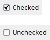
A checkbox is a labelled box which by default is either on (checkmark is visible) or off (no checkmark).
Optionally (when the CHK_3STATE style flag is set) it can have a third state, called the mixed or undetermined state. Often this is used as a “Does Not Apply” state.
 Window Styles
This class supports the following styles:
 Events Emitted by this Class
Handlers bound for the following event types will receive a CommandEvent parameter.
See also
 Methods Summary
| __init__ | Default constructor. |
| Create | Creates the checkbox for two-step construction. |
| Get3StateValue | Gets the state of a 3-state checkbox. |
| GetValue | Gets the state of a 2-state checkbox. |
| Is3State | Returns whether or not the checkbox is a 3-state checkbox. |
| Is3rdStateAllowedForUser | Returns whether or not the user can set the checkbox to the third state. |
| IsChecked | This is just a maybe more readable synonym for GetValue : just as the latter, it returns True if the checkbox is checked and False otherwise. |
| Set3StateValue | Sets the checkbox to the given state. |
| SetValue | Sets the checkbox to the given state. |
 Properties Summary
| ThreeStateValue | See Get3StateValue and Set3StateValue |
| Value | See GetValue and SetValue |
 Class API
A checkbox is a labelled box which by default is either on (checkmark is visible) or off (no checkmark).
Possible constructors:
CheckBox()

CheckBox(parent, id=ID_ANY, label='', pos=DefaultPosition,
         size=DefaultSize, style=0, validator=DefaultValidator,
         name=CheckBoxNameStr)
 Overloaded Implementations:
__init__ (self)
Default constructor.
__init__ (self, parent, id=ID_ANY, label=’‘, pos=DefaultPosition, size=DefaultSize, style=0, validator=DefaultValidator, name=CheckBoxNameStr)
Constructor, creating and showing a checkbox.
| Parameters: |
|
|---|
Creates the checkbox for two-step construction.
See CheckBox for details.
| Parameters: | |
|---|---|
| Return type: | bool |
Gets the state of a 3-state checkbox.
Asserts when the function is used with a 2-state checkbox.
| Return type: | CheckBoxState |
|---|
Gets the state of a 2-state checkbox.
| Return type: | bool |
|---|---|
| Returns: | Returns True if it is checked, False otherwise. |
Returns whether or not the checkbox is a 3-state checkbox.
| Return type: | bool |
|---|---|
| Returns: | True if this checkbox is a 3-state checkbox, False if it’s a 2-state checkbox. |
Returns whether or not the user can set the checkbox to the third state.
| Return type: | bool |
|---|---|
| Returns: | True if the user can set the third state of this checkbox, False if it can only be set programmatically or if it’s a 2-state checkbox. |
This is just a maybe more readable synonym for GetValue : just as the latter, it returns True if the checkbox is checked and False otherwise.
| Return type: | bool |
|---|
Sets the checkbox to the given state.
This does not cause a wxEVT_COMMAND_CHECKBOX_CLICKED event to get emitted.
Asserts when the checkbox is a 2-state checkbox and setting the state to CHK_UNDETERMINED.
| Parameters: | state (CheckBoxState) – |
|---|
Sets the checkbox to the given state.
This does not cause a wxEVT_COMMAND_CHECKBOX_CLICKED event to get emitted.
| Parameters: | state (bool) – If True, the check is on, otherwise it is off. |
|---|
See Get3StateValue and Set3StateValue


 Inheritance Diagram
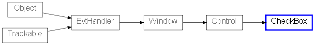
 Control Appearance