 ListCtrl
A list control presents lists in a number of formats: list view, report view, icon view and small icon view.
In any case, elements are numbered from zero. For all these modes, the items are stored in the control and must be added to it using ListCtrl.InsertItem method.
A special case of report view quite different from the other modes of the list control is a virtual control in which the items data (including text, images and attributes) is managed by the main program and is requested by the control itself only when needed which allows to have controls with millions of items without consuming much memory. To use virtual list control you must use ListCtrl.SetItemCount first and override at least ListCtrl.OnGetItemText (and optionally ListCtrl.OnGetItemImage or ListCtrl.OnGetItemColumnImage and ListCtrl.OnGetItemAttr ) to return the information about the items when the control requests it.
Virtual list control can be used as a normal one except that no operations which can take time proportional to the number of items in the control happen – this is required to allow having a practically infinite number of items. For example, in a multiple selection virtual list control, the selections won’t be sent when many items are selected at once because this could mean iterating over all the items.
Using many of ListCtrl features is shown in the .
To intercept events from a list control, use the event table macros described in ListEvent.
Mac Note: Starting with wxWidgets 2.8, ListCtrl uses a native implementation for report mode, and uses a generic implementation for other modes. You can use the generic implementation for report mode as well by setting the mac.listctrl.always_use_generic system option (see SystemOptions) to 1.
 Window Styles
This class supports the following styles:
 Events Emitted by this Class
Handlers bound for the following event types will receive a ListEvent parameter.
See also
ListCtrl Overview, ListView, ListBox, TreeCtrl, ImageList, ListEvent, ListItem, EditableListBox
 Methods Summary
| __init__ | Default constructor. |
| Append | Append an item to the list control. The entry parameter should be a |
| AppendColumn | Adds a new column to the list control in report view mode. |
| Arrange | Arranges the items in icon or small icon view. |
| AssignImageList | Sets the image list associated with the control and takes ownership of it (i.e. |
| ClearAll | Deletes all items and all columns. |
| ClearColumnImage | |
| Create | Creates the list control. |
| DeleteAllItems | Deletes all items in the list control. |
| DeleteColumn | Deletes a column. |
| DeleteItem | Deletes the specified item. |
| EditLabel | Starts editing the label of the given item. |
| EnsureVisible | Ensures this item is visible. |
| FindItem | Find an item whose label matches this string, starting from start or the beginning if start is -1 . |
| Focus | Focus and show the given item |
| GetColumnCount | Returns the number of columns. |
| GetColumnIndexFromOrder | Gets the column index from its position in visual order. |
| GetColumnOrder | Gets the column visual order position. |
| GetColumnWidth | Gets the column width (report view only). |
| GetColumnsOrder | Returns the array containing the orders of all columns. |
| GetCountPerPage | Gets the number of items that can fit vertically in the visible area of the list control (list or report view) or the total number of items in the list control (icon or small icon view). |
| GetEditControl | Returns the edit control being currently used to edit a label. |
| GetFirstSelected | return first selected item, or -1 when none |
| GetFocusedItem | get the currently focused item or -1 if none |
| GetImageList | Returns the specified image list. |
| GetItemBackgroundColour | Returns the colour for this item. |
| GetItemCount | Returns the number of items in the list control. |
| GetItemData | Gets the application-defined data associated with this item. |
| GetItemFont | Returns the item’s font. |
| GetItemSpacing | Retrieves the spacing between icons in pixels: horizontal spacing is returned as x component of the Size object and the vertical spacing as its y component. |
| GetItemState | Gets the item state. |
| GetItemText | Gets the item text for this item. |
| GetItemTextColour | Returns the colour for this item. |
| GetMainWindow | |
| GetNextItem | Searches for an item with the given geometry or state, starting from item but excluding the item itself. |
| GetNextSelected | return subsequent selected items, or -1 when no more |
| GetSelectedItemCount | Returns the number of selected items in the list control. |
| GetSubItemRect | Returns the rectangle representing the size and position, in physical coordinates, of the given subitem, i.e. |
| GetTextColour | Gets the text colour of the list control. |
| GetTopItem | Gets the index of the topmost visible item when in list or report view. |
| GetViewRect | Returns the rectangle taken by all items in the control. |
| HasColumnOrderSupport | |
| HitTest | Determines which item (if any) is at the specified point, giving details in flags. |
| InReportView | Returns True if the control is currently using LC_REPORT style. |
| InsertColumn | For report view mode (only), inserts a column. |
| InsertItem | Inserts an item, returning the index of the new item if successful, -1 otherwise. |
| IsSelected | return True if the item is selected |
| IsVirtual | Returns True if the control is currently in virtual report view. |
| OnGetItemAttr | This function may be overridden in the derived class for a control with LC_VIRTUAL style. |
| OnGetItemColumnImage | Override this function in the derived class for a control with LC_VIRTUAL and LC_REPORT styles in order to specify the image index for the given line and column. |
| OnGetItemImage | This function must be overridden in the derived class for a control with LC_VIRTUAL style having an “image list” (see SetImageList ; if the control doesn’t have an image list, it is not necessary to override it). |
| OnGetItemText | This function must be overridden in the derived class for a control with LC_VIRTUAL style. |
| RefreshItem | Redraws the given item. |
| RefreshItems | Redraws the items between itemFrom and itemTo. |
| ScrollList | Scrolls the list control. |
| Select | [de]select an item |
| SetBackgroundColour | Sets the background colour. |
| SetColumn | Sets information about this column. |
| SetColumnImage | |
| SetColumnWidth | Sets the column width. |
| SetColumnsOrder | Changes the order in which the columns are shown. |
| SetImageList | Sets the image list associated with the control. |
| SetItem | Sets the data of an item. |
| SetItemBackgroundColour | Sets the background colour for this item. |
| SetItemColumnImage | Sets the image associated with the item. |
| SetItemCount | This method can only be used with virtual list controls. |
| SetItemData | Associates application-defined data with this item. |
| SetItemFont | Sets the item’s font. |
| SetItemImage | Sets the unselected and selected images associated with the item. |
| SetItemPosition | Sets the position of the item, in icon or small icon view. |
| SetItemPtrData | Associates application-defined data with this item. |
| SetItemState | Sets the item state. |
| SetItemText | Sets the item text for this item. |
| SetItemTextColour | Sets the colour for this item. |
| SetSingleStyle | Adds or removes a single window style. |
| SetTextColour | Sets the text colour of the list control. |
| SetWindowStyleFlag | Sets the whole window style, deleting all items. |
| SortItems | Call this function to sort the items in the list control. |
 Properties Summary
| Column | See GetColumn and SetColumn |
| ColumnCount | See GetColumnCount |
| ColumnsOrder | See GetColumnsOrder and SetColumnsOrder |
| CountPerPage | See GetCountPerPage |
| EditControl | See GetEditControl |
| FocusedItem | See GetFocusedItem |
| Item | See GetItem and SetItem |
| ItemCount | See GetItemCount and SetItemCount |
| ItemPosition | See GetItemPosition and SetItemPosition |
| ItemRect | See GetItemRect |
| ItemSpacing | See GetItemSpacing |
| MainWindow | See GetMainWindow |
| SelectedItemCount | See GetSelectedItemCount |
| TextColour | See GetTextColour and SetTextColour |
| TopItem | See GetTopItem |
| ViewRect | See GetViewRect |
 Class API
A list control presents lists in a number of formats: list view, report view, icon view and small icon view.
Possible constructors:
ListCtrl()

ListCtrl(parent, id=ID_ANY, pos=DefaultPosition, size=DefaultSize,
         style=LC_ICON, validator=DefaultValidator, name=ListCtrlNameStr)
 Overloaded Implementations:
__init__ (self)
Default constructor.
__init__ (self, parent, id=ID_ANY, pos=DefaultPosition, size=DefaultSize, style=LC_ICON, validator=DefaultValidator, name=ListCtrlNameStr)
Constructor, creating and showing a list control.
| Parameters: |
|
|---|
Append an item to the list control. The entry parameter should be a sequence with an item for each column
Adds a new column to the list control in report view mode.
This is just a convenient wrapper for InsertColumn which adds the new column after all the existing ones without having to specify its position explicitly.
| Parameters: |
|
|---|---|
| Return type: | long |
New in version 2.9.4.
Arranges the items in icon or small icon view.
This only has effect on Win32. flag is one of:
| Parameters: | flag (int) – |
|---|---|
| Return type: | bool |
Sets the image list associated with the control and takes ownership of it (i.e.
the control will, unlike when using SetImageList , delete the list when destroyed). which is one of IMAGE_LIST_NORMAL , IMAGE_LIST_SMALL , IMAGE_LIST_STATE (the last is unimplemented).
| Parameters: |
|
|---|
See also
Deletes all items and all columns.
Note
This sends an event of type wxEVT_COMMAND_LIST_DELETE_ALL_ITEMS under all platforms.
Creates the list control.
See ListCtrl for further details.
| Parameters: | |
|---|---|
| Return type: | bool |
Deletes all items in the list control.
This function does not send the wxEVT_COMMAND_LIST_DELETE_ITEM event because deleting many items from the control would be too slow then (unlike ListCtrl.DeleteItem ) but it does send the special wxEVT_COMMAND_LIST_DELETE_ALL_ITEMS event if the control was not empty. If it was already empty, nothing is done and no event is sent.
| Return type: | bool |
|---|---|
| Returns: | True if the items were successfully deleted or if the control was already empty, False if an error occurred while deleting the items. |
Deletes a column.
| Parameters: | col (int) – |
|---|---|
| Return type: | bool |
Deletes the specified item.
This function sends the wxEVT_COMMAND_LIST_DELETE_ITEM event for the item being deleted.
| Parameters: | item (long) – |
|---|---|
| Return type: | bool |
See also
Starts editing the label of the given item.
This function generates a EVT_LIST_BEGIN_LABEL_EDIT event which can be vetoed so that no text control will appear for in-place editing.
If the user changed the label (i.e. s/he does not press ESC or leave the text control without changes, a EVT_LIST_END_LABEL_EDIT event will be sent which can be vetoed as well.
| Parameters: | item (long) – |
|---|---|
| Return type: | TextCtrl |
Ensures this item is visible.
| Parameters: | item (long) – |
|---|---|
| Return type: | bool |
Overloaded Implementations:
FindItem (self, start, str, partial=False)
Find an item whose label matches this string, starting from start or the beginning if start is -1 .
The string comparison is case insensitive.
If partial is True then this method will look for items which begin with str.
| Parameters: |
|
|---|---|
| Return type: | long |
| Returns: | The next matching item if any or -1 (NOT_FOUND) otherwise. |
FindItem (self, start, data)
Find an item whose data matches this data, starting from start or the beginning if ‘start’ is -1 .
| Parameters: |
|
|---|---|
| Return type: | long |
| Returns: | The next matching item if any or -1 (NOT_FOUND) otherwise. |
FindItem (self, start, pt, direction)
Find an item nearest this position in the specified direction, starting from start or the beginning if start is -1.
| Parameters: |
|
|---|---|
| Return type: | long |
| Returns: | The next matching item if any or -1 (NOT_FOUND) otherwise. |
Focus and show the given item
Returns the number of columns.
| Return type: | int |
|---|
Gets the column index from its position in visual order.
After calling SetColumnsOrder , the index returned by this function corresponds to the value of the element number pos in the array returned by GetColumnsOrder .
Please see SetColumnsOrder documentation for an example and additional remarks about the columns ordering.
| Parameters: | pos (int) – |
|---|---|
| Return type: | int |
See also
Gets the column visual order position.
This function returns the index of the column which appears at the given visual position, e.g. calling it with col equal to 0 returns the index of the first shown column.
Please see SetColumnsOrder documentation for an example and additional remarks about the columns ordering.
| Parameters: | col (int) – |
|---|---|
| Return type: | int |
See also
Gets the column width (report view only).
| Parameters: | col (int) – |
|---|---|
| Return type: | int |
Returns the array containing the orders of all columns.
On error, an empty array is returned.
Please see SetColumnsOrder documentation for an example and additional remarks about the columns ordering.
| Return type: | list of integers |
|---|
See also
Gets the number of items that can fit vertically in the visible area of the list control (list or report view) or the total number of items in the list control (icon or small icon view).
| Return type: | int |
|---|
Returns the edit control being currently used to edit a label.
Returns None if no label is being edited.
| Return type: | TextCtrl |
|---|
Note
It is currently only implemented for wxMSW and the generic version, not for the native Mac OS X version.
return first selected item, or -1 when none
get the currently focused item or -1 if none
Returns the specified image list.
which may be one of:
| Parameters: | which (int) – |
|---|---|
| Return type: | ImageList |
Returns the colour for this item.
If the item has no specific colour, returns an invalid colour (and not the default background control of the control itself).
| Parameters: | item (long) – |
|---|---|
| Return type: | Colour |
See also
Returns the number of items in the list control.
| Return type: | int |
|---|
Gets the application-defined data associated with this item.
| Parameters: | item (long) – |
|---|---|
| Return type: | int |
Retrieves the spacing between icons in pixels: horizontal spacing is returned as x component of the Size object and the vertical spacing as its y component.
| Return type: | Size |
|---|
Gets the item state.
For a list of state flags, see SetItem . The stateMask indicates which state flags are of interest.
| Parameters: |
|
|---|---|
| Return type: | int |
Gets the item text for this item.
| Parameters: |
|
|---|---|
| Return type: | string |
Returns the colour for this item.
If the item has no specific colour, returns an invalid colour (and not the default foreground control of the control itself as this wouldn’t allow distinguishing between items having the same colour as the current control foreground and items with default colour which, hence, have always the same colour as the control).
| Parameters: | item (long) – |
|---|---|
| Return type: | Colour |
Searches for an item with the given geometry or state, starting from item but excluding the item itself.
If item is -1, the first item that matches the specified flags will be returned. Returns the first item with given state following item or -1 if no such item found. This function may be used to find all selected items in the control like this:
item = -1

while 1:
    item = listctrl.GetNextItem(item,
                                wx.LIST_NEXT_ALL,
                                wx.LIST_STATE_SELECTED)
    if item == -1:
        break

    # This item is selected - do whatever is needed with it
    wx.LogMessage("Item %ld is selected"%item)
geometry can be one of:
state can be a bitlist of the following:
| Parameters: |
|
|---|---|
| Return type: | long |
Note
this parameter is only supported by wxMSW currently and ignored on other platforms.
return subsequent selected items, or -1 when no more
Returns the number of selected items in the list control.
| Return type: | int |
|---|
Returns the rectangle representing the size and position, in physical coordinates, of the given subitem, i.e.
the part of the row item in the column subItem.
This method is only meaningful when the ListCtrl is in the report mode. If subItem parameter is equal to the special value LIST_GETSUBITEMRECT_WHOLEITEM the return value is the same as for GetItemRect .
code can be one of LIST_RECT_BOUNDS , LIST_RECT_ICON or LIST_RECT_LABEL .
| Parameters: |
|
|---|---|
| Return type: | bool |
New in version 2.7.0.
Gets the index of the topmost visible item when in list or report view.
| Return type: | long |
|---|
Returns the rectangle taken by all items in the control.
In other words, if the controls client size were equal to the size of this rectangle, no scrollbars would be needed and no free space would be left.
Note that this function only works in the icon and small icon views, not in list or report views (this is a limitation of the native Win32 control).
| Return type: | Rect |
|---|
| Return type: | bool |
|---|
Determines which item (if any) is at the specified point, giving details in flags.
Returns index of the item or NOT_FOUND if no item is at the specified point.
flags will be a combination of the following flags:
If ptrSubItem is not None and the ListCtrl is in the report mode the subitem (or column) number will also be provided. This feature is only available in version 2.7.0 or higher and is currently only implemented under wxMSW and requires at least comctl32.dll of verion 4.70 on the host system or the value stored in ptrSubItem will be always -1. To compile this feature into wxWidgets library you need to have access to commctrl.h of version 4.70 that is provided by Microsoft.
| Parameters: | point (Point) – |
|---|---|
| Return type: | tuple |
| Returns: | ( long, flags, ptrSubItem ) |
Returns True if the control is currently using LC_REPORT style.
| Return type: | bool |
|---|
Overloaded Implementations:
InsertColumn (self, col, info)
For report view mode (only), inserts a column.
For more details, see SetItem . Also see InsertColumn(long, string, int, int) overload for a usually more convenient alternative to this method and the description of how the item width is interpreted by this method.
| Parameters: |
|
|---|---|
| Return type: | long |
InsertColumn (self, col, heading, format=LIST_FORMAT_LEFT, width=LIST_AUTOSIZE)
For report view mode (only), inserts a column.
Insert a new column in the list control in report view mode at the given position specifying its most common attributes.
Notice that to set the image for the column you need to use Insert(long, ListItem) overload and specify LIST_MASK_IMAGE in the item mask.
| Parameters: |
|
|---|---|
| Return type: | long |
| Returns: | The index of the inserted column or -1 if adding it failed. |
Overloaded Implementations:
InsertItem (self, info)
Inserts an item, returning the index of the new item if successful, -1 otherwise.
| Parameters: | info (ListItem) – ListItem object |
|---|---|
| Return type: | long |
InsertItem (self, index, label)
Insert an string item.
| Parameters: |
|
|---|---|
| Return type: | long |
InsertItem (self, index, imageIndex)
Insert an image item.
| Parameters: |
|
|---|---|
| Return type: | long |
InsertItem (self, index, label, imageIndex)
Insert an image/string item.
| Parameters: |
|
|---|---|
| Return type: | long |
return True if the item is selected
Returns True if the control is currently in virtual report view.
| Return type: | bool |
|---|
This function may be overridden in the derived class for a control with LC_VIRTUAL style.
It should return the attribute for the specified item or None to use the default appearance parameters.
ListCtrl will not delete the pointer or keep a reference of it. You can return the same ListItemAttr pointer for every OnGetItemAttr call.
The base class version always returns None.
| Parameters: | item (long) – |
|---|---|
| Return type: | ListItemAttr |
See also
OnGetItemImage , OnGetItemColumnImage , OnGetItemText , OnGetItemColumnAttr
Override this function in the derived class for a control with LC_VIRTUAL and LC_REPORT styles in order to specify the image index for the given line and column.
The base class version always calls OnGetItemImage for the first column, else it returns -1.
| Parameters: |
|
|---|---|
| Return type: | int |
See also
OnGetItemText , OnGetItemImage , OnGetItemAttr , OnGetItemColumnAttr
This function must be overridden in the derived class for a control with LC_VIRTUAL style having an “image list” (see SetImageList ; if the control doesn’t have an image list, it is not necessary to override it).
It should return the index of the items image in the controls image list or -1 for no image.
In a control with LC_REPORT style, OnGetItemImage only gets called for the first column of each line.
The base class version always returns -1.
| Parameters: | item (long) – |
|---|---|
| Return type: | int |
See also
This function must be overridden in the derived class for a control with LC_VIRTUAL style.
It should return the string containing the text of the given column for the specified item .
| Parameters: |
|
|---|---|
| Return type: | string |
See also
SetItemCount , OnGetItemImage , OnGetItemColumnImage , OnGetItemAttr
Redraws the given item.
This is only useful for the virtual list controls as without calling this function the displayed value of the item doesn’t change even when the underlying data does change.
| Parameters: | item (long) – |
|---|
See also
Redraws the items between itemFrom and itemTo.
The starting item must be less than or equal to the ending one.
Just as RefreshItem this is only useful for virtual list controls.
| Parameters: |
|
|---|
Scrolls the list control.
If in icon, small icon or report view mode, dx specifies the number of pixels to scroll. If in list view mode, dx specifies the number of columns to scroll. dy always specifies the number of pixels to scroll vertically.
| Parameters: |
|
|---|---|
| Return type: | bool |
Note
This method is currently only implemented in the Windows version.
[de]select an item
Sets the background colour.
Note that the Window.GetBackgroundColour function of Window base class can be used to retrieve the current background colour.
| Parameters: | col (Colour) – |
|---|---|
| Return type: | bool |
Sets information about this column.
See SetItem for more information.
| Parameters: |
|
|---|---|
| Return type: | bool |
Sets the column width.
width can be a width in pixels or LIST_AUTOSIZE (-1) or LIST_AUTOSIZE_USEHEADER (-2).
LIST_AUTOSIZE will resize the column to the length of its longest item.
LIST_AUTOSIZE_USEHEADER will resize the column to the length of the header (Win32) or 80 pixels (other platforms).
In small or normal icon view, col must be -1, and the column width is set for all columns.
| Parameters: |
|
|---|---|
| Return type: | bool |
Changes the order in which the columns are shown.
By default, the columns of a list control appear on the screen in order of their indices, i.e. the column 0 appears first, the column 1 next and so on. However by using this function it is possible to arbitrarily reorder the columns visual order and the user can also rearrange the columns interactively by dragging them. In this case, the index of the column is not the same as its order and the functions GetColumnOrder and GetColumnIndexFromOrder should be used to translate between them. Notice that all the other functions still work with the column indices, i.e. the visual positioning of the columns on screen doesn’t affect the code setting or getting their values for example.
The orders array must have the same number elements as the number of columns and contain each position exactly once. Its n-th element contains the index of the column to be shown in n-th position, so for a control with three columns passing an array with elements 2, 0 and 1 results in the third column being displayed first, the first one next and the second one last.
Example of using it:
listCtrl = wx.ListCtrl(parent, style=wx.LC_REPORT)

for i in range(3):
    listCtrl.InsertColumn(i, "Column %d"%i)

order = [2, 0, 1]
listCtrl.SetColumnsOrder(order)

# now listCtrl.GetColumnsOrder() will return order and
# listCtrl.GetColumnIndexFromOrder(n) will return order[n] and
# listCtrl.GetColumnOrder() will return 1, 2 and 0 for the column 0,
# 1 and 2 respectively
Please notice that this function makes sense for report view only and currently is only implemented in wxMSW port. To avoid explicit tests for __WXMSW__ in your code, please use HAS_LISTCTRL_COLUMN_ORDER as this will allow it to start working under the other platforms when support for the column reordering is added there.
| Parameters: | orders (list of integers) – |
|---|---|
| Return type: | bool |
See also
Sets the image list associated with the control.
which is one of IMAGE_LIST_NORMAL , IMAGE_LIST_SMALL , IMAGE_LIST_STATE (the last is unimplemented).
This method does not take ownership of the image list, you have to delete it yourself.
| Parameters: |
|
|---|
See also
Overloaded Implementations:
SetItem (self, info)
Sets the data of an item.
Using the ListItem’s mask and state mask, you can change only selected attributes of a ListCtrl item.
| Parameters: | info (ListItem) – |
|---|---|
| Return type: | bool |
SetItem (self, index, column, label, imageId=-1)
Sets an item string field at a particular column.
| Parameters: |
|
|---|---|
| Return type: | long |
Sets the background colour for this item.
This function only works in report view mode. The colour can be retrieved using GetItemBackgroundColour .
| Parameters: |
|
|---|
Sets the image associated with the item.
In report view, you can specify the column. The image is an index into the image list associated with the list control.
| Parameters: |
|
|---|---|
| Return type: | bool |
This method can only be used with virtual list controls.
It is used to indicate to the control the number of items it contains. After calling it, the main program should be ready to handle calls to various item callbacks (such as ListCtrl.OnGetItemText ) for all items in the range from 0 to count.
Notice that the control is not necessarily redrawn after this call as it may be undesirable if an item which is not visible on the screen anyhow was added to or removed from a control displaying many items, if you do need to refresh the display you can just call Refresh manually.
| Parameters: | count (long) – |
|---|
Associates application-defined data with this item.
Notice that this function cannot be used to associate pointers with the control items, use SetItemPtrData instead.
| Parameters: |
|
|---|---|
| Return type: | bool |
Sets the unselected and selected images associated with the item.
The images are indices into the image list associated with the list control.
| Parameters: |
|
|---|---|
| Return type: | bool |
Sets the position of the item, in icon or small icon view.
Windows only.
| Parameters: |
|
|---|---|
| Return type: | bool |
Associates application-defined data with this item.
The data parameter may be either an integer or a pointer cast to the UIntPtr type which is guaranteed to be large enough to be able to contain all integer types and pointers.
| Parameters: |
|
|---|---|
| Return type: | bool |
New in version 2.8.4.
Sets the item state.
The stateMask is a combination of LIST_STATE_XXX constants described in ListItem documentation. For each of the bits specified in stateMask, the corresponding state is set or cleared depending on whether state argument contains the same bit or not.
So to select an item you can use
listCtrl.SetItemState(item, wx.LIST_STATE_SELECTED, wx.LIST_STATE_SELECTED)
while to deselect it you should use
listCtrl.SetItemState(item, 0, wx.LIST_STATE_SELECTED)
Consider using ListView if possible to avoid dealing with this error-prone and confusing method.
| Parameters: |
|
|---|---|
| Return type: | bool |
Sets the item text for this item.
| Parameters: |
|
|---|
Sets the colour for this item.
This function only works in report view. The colour can be retrieved using GetItemTextColour .
| Parameters: |
|
|---|
Adds or removes a single window style.
| Parameters: |
|
|---|
Sets the whole window style, deleting all items.
| Parameters: | style (long) – |
|---|
Call this function to sort the items in the list control.
Sorting is done using the specified fnSortCallBack function. This function must have the following prototype:
def ListCompareFunction(self, item1, item2):

    pass
It is called each time when the two items must be compared and should return 0 if the items are equal, negative value if the first item is less than the second one and positive value if the first one is greater than the second one (the same convention as used by qsort(3) ).
The parameter item1 is the client data associated with the first item (NOT the index). The parameter item2 is the client data associated with the second item (NOT the index). The parameter data is the value passed to SortItems itself.
Notice that the control may only be sorted on client data associated with the items, so you must use SetItemData if you want to be able to sort the items in the control.
Please see the for an example of using this function.
| Parameters: | fnSortCallBack (PyObject) – |
|---|---|
| Return type: | bool |
See GetColumnCount
See GetColumnsOrder and SetColumnsOrder
See GetCountPerPage
See GetEditControl
See GetFocusedItem
See GetItemCount and SetItemCount
See GetItemPosition and SetItemPosition
See GetItemRect
See GetItemSpacing
See GetMainWindow
See GetTextColour and SetTextColour
See GetTopItem
See GetViewRect


 Inheritance Diagram
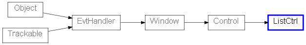
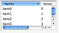
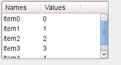
 Control Appearance
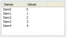
 Known Subclasses