 RadioButton
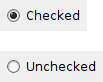
A radio button item is a button which usually denotes one of several mutually exclusive options.
It has a text label next to a (usually) round button.
You can create a group of mutually-exclusive radio buttons by specifying RB_GROUP for the first in the group. The group ends when another radio button group is created, or there are no more radio buttons.
 Window Styles
This class supports the following styles:
 Events Emitted by this Class
Handlers bound for the following event types will receive a CommandEvent parameter.
See also
 Methods Summary
| __init__ | Default constructor. |
| Create | Creates the choice for two-step construction. |
| GetValue | Returns True if the radio button is checked, False otherwise. |
| SetValue | Sets the radio button to checked or unchecked status. |
 Class API
A radio button item is a button which usually denotes one of several mutually exclusive options.
Possible constructors:
RadioButton()

RadioButton(parent, id=ID_ANY, label='', pos=DefaultPosition,
            size=DefaultSize, style=0, validator=DefaultValidator,
            name=RadioButtonNameStr)
 Overloaded Implementations:
__init__ (self)
Default constructor.
__init__ (self, parent, id=ID_ANY, label=’‘, pos=DefaultPosition, size=DefaultSize, style=0, validator=DefaultValidator, name=RadioButtonNameStr)
Constructor, creating and showing a radio button.
| Parameters: |
|
|---|
Creates the choice for two-step construction.
See RadioButton for further details.
| Parameters: | |
|---|---|
| Return type: | bool |
Returns True if the radio button is checked, False otherwise.
| Return type: | bool |
|---|
Sets the radio button to checked or unchecked status.
This does not cause a wxEVT_COMMAND_RADIOBUTTON_SELECTED event to get emitted.
If the radio button belongs to a radio group exactly one button in the group may be checked and so this method can be only called with value set to True. To uncheck a radio button in a group you must check another button in the same group.
| Parameters: | value (bool) – True to check, False to uncheck. |
|---|


 Inheritance Diagram
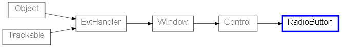
 Control Appearance

 Properties Summary