TreeCtrl
A tree control presents information as a hierarchy, with items that may be expanded to show further items.
Items in a tree control are referenced by TreeItemId handles, which may be tested for validity by calling TreeItemId.IsOk .
A similar control with a fully native implementation for GTK+ and OS X as well is DataViewTreeCtrl.
To intercept events from a tree control, use the event table macros described in TreeEvent.
 Window Styles
This class supports the following styles:
 Events Emitted by this Class
Handlers bound for the following event types will receive a TreeEvent parameter.
See also
Win32 notes:
TreeCtrl class uses the standard common treeview control under Win32 implemented in the system library comctl32.dll. Some versions of this library are known to have bugs with handling the tree control colours: the usual symptom is that the expanded items leave black (or otherwise incorrectly coloured) background behind them, especially for the controls using non-default background colour. The recommended solution is to upgrade the comctl32.dll to a newer version: see http://www.microsoft.com/downloads/details.aspx?familyid=cb2cf3a2-8025-4e8f-8511-9b476a8d35d2
See also
DataViewTreeCtrl, TreeEvent, TreeItemData, TreeCtrl Overview, ListBox, ListCtrl, ImageList
 Methods Summary
| __init__ | Default Constructor. |
| AddRoot | Adds the root node to the tree, returning the new item. |
| AppendItem | Appends an item to the end of the branch identified by parent, return a new item id. |
| AssignImageList | Sets the normal image list. |
| AssignStateImageList | Sets the state image list. |
| ClearFocusedItem | Clears the currently focused item. |
| Collapse | Collapses the given item. |
| CollapseAll | Collapses the root item. |
| CollapseAllChildren | Collapses this item and all of its children, recursively. |
| CollapseAndReset | Collapses the given item and removes all children. |
| Create | Creates the tree control. |
| Delete | Deletes the specified item. |
| DeleteAllItems | Deletes all items in the control. |
| DeleteChildren | Deletes all children of the given item (but not the item itself). |
| EditLabel | Starts editing the label of the given item. |
| EndEditLabel | Ends label editing. |
| EnsureVisible | Scrolls and/or expands items to ensure that the given item is visible. |
| Expand | Expands the given item. |
| ExpandAll | Expands all items in the tree. |
| ExpandAllChildren | Expands the given item and all its children recursively. |
| GetChildrenCount | Returns the number of items in the branch. |
| GetCount | Returns the number of items in the control. |
| GetEditControl | Returns the edit control being currently used to edit a label. |
| GetFirstChild | Returns the first child; call GetNextChild for the next child. |
| GetFirstVisibleItem | Returns the first visible item. |
| GetFocusedItem | Returns the item last clicked or otherwise selected. |
| GetImageList | Returns the normal image list. |
| GetIndent | Returns the current tree control indentation. |
| GetItemBackgroundColour | Returns the background colour of the item. |
| GetItemData | Returns the tree item data associated with the item. |
| GetItemFont | Returns the font of the item label. |
| GetItemImage | Gets the specified item image. |
| GetItemParent | Returns the item’s parent. |
| GetItemState | Gets the specified item state. |
| GetItemText | Returns the item label. |
| GetItemTextColour | Returns the colour of the item label. |
| GetLastChild | Returns the last child of the item (or an invalid tree item if this item has no children). |
| GetNextChild | Returns the next child; call GetFirstChild for the first child. |
| GetNextSibling | Returns the next sibling of the specified item; call GetPrevSibling for the previous sibling. |
| GetNextVisible | Returns the next visible item or an invalid item if this item is the last visible one. |
| GetPrevSibling | Returns the previous sibling of the specified item; call GetNextSibling for the next sibling. |
| GetPrevVisible | Returns the previous visible item or an invalid item if this item is the first visible one. |
| GetQuickBestSize | Returns True if the control will use a quick calculation for the best size, looking only at the first and last items. |
| GetRootItem | Returns the root item for the tree control. |
| GetSelection | Returns the selection, or an invalid item if there is no selection. |
| GetStateImageList | Returns the state image list (from which application-defined state images are taken). |
| HitTest | Calculates which (if any) item is under the given point, returning the tree item id at this point plus extra information flags. |
| InsertItem | Inserts an item after a given one (previous). |
| IsBold | Returns True if the given item is in bold state. |
| IsEmpty | Returns True if the control is empty (i.e. |
| IsExpanded | Returns True if the item is expanded (only makes sense if it has children). |
| IsSelected | Returns True if the item is selected. |
| IsVisible | Returns True if the item is visible on the screen. |
| ItemHasChildren | Returns True if the item has children. |
| OnCompareItems | Override this function in the derived class to change the sort order of the items in the tree control. |
| PrependItem | Appends an item as the first child of parent, return a new item id. |
| ScrollTo | Scrolls the specified item into view. |
| SelectChildren | Select all the immediate children of the given parent. |
| SelectItem | Selects the given item. |
| SetFocusedItem | Sets the currently focused item. |
| SetImageList | Sets the normal image list. |
| SetIndent | Sets the indentation for the tree control. |
| SetItemBackgroundColour | Sets the colour of the item’s background. |
| SetItemBold | Makes item appear in bold font if bold parameter is True or resets it to the normal state. |
| SetItemData | Sets the item client data. |
| SetItemDropHighlight | Gives the item the visual feedback for Drag’n’Drop actions, which is useful if something is dragged from the outside onto the tree control (as opposed to a DnD operation within the tree control, which already is implemented internally). |
| SetItemFont | Sets the item’s font. |
| SetItemHasChildren | Force appearance of the button next to the item. |
| SetItemImage | Sets the specified item’s image. |
| SetItemState | Sets the specified item state. |
| SetItemText | Sets the item label. |
| SetItemTextColour | Sets the colour of the item’s text. |
| SetQuickBestSize | If True is passed, specifies that the control will use a quick calculation for the best size, looking only at the first and last items. |
| SetStateImageList | Sets the state image list (from which application-defined state images are taken). |
| SetWindowStyle | Sets the mode flags associated with the display of the tree control. |
| SortChildren | Sorts the children of the given item using OnCompareItems . |
| Toggle | Toggles the given item between collapsed and expanded states. |
| ToggleItemSelection | Toggles the given item between selected and unselected states. |
| Unselect | Removes the selection from the currently selected item (if any). |
| UnselectAll | This function either behaves the same as Unselect if the control doesn’t have TR_MULTIPLE style, or removes the selection from all items if it does have this style. |
| UnselectItem | Unselects the given item. |
 Properties Summary
| BoundingRect | See GetBoundingRect |
| Count | See GetCount |
| EditControl | See GetEditControl |
| FirstVisibleItem | See GetFirstVisibleItem |
| FocusedItem | See GetFocusedItem and SetFocusedItem |
| ImageList | See GetImageList and SetImageList |
| Indent | See GetIndent and SetIndent |
| QuickBestSize | See GetQuickBestSize and SetQuickBestSize |
| RootItem | See GetRootItem |
| Selection | See GetSelection |
| Selections | See GetSelections |
| StateImageList | See GetStateImageList and SetStateImageList |
 Class API
A tree control presents information as a hierarchy, with items that may be expanded to show further items.
Possible constructors:
TreeCtrl()

TreeCtrl(parent, id=ID_ANY, pos=DefaultPosition, size=DefaultSize,
         style=TR_DEFAULT_STYLE, validator=DefaultValidator,
         name=TreeCtrlNameStr)
 Overloaded Implementations:
__init__ (self)
Default Constructor.
__init__ (self, parent, id=ID_ANY, pos=DefaultPosition, size=DefaultSize, style=TR_DEFAULT_STYLE, validator=DefaultValidator, name=TreeCtrlNameStr)
Constructor, creating and showing a tree control.
| Parameters: |
|
|---|
Adds the root node to the tree, returning the new item.
The image and selImage parameters are an index within the normal image list specifying the image to use for unselected and selected items, respectively. If image -1 and selImage is -1, the same image is used for both selected and unselected items.
| Parameters: |
|
|---|---|
| Return type: |
Appends an item to the end of the branch identified by parent, return a new item id.
The image and selImage parameters are an index within the normal image list specifying the image to use for unselected and selected items, respectively. If image -1 and selImage is -1, the same image is used for both selected and unselected items.
| Parameters: |
|
|---|---|
| Return type: |
Sets the normal image list.
The image list assigned with this method will be automatically deleted by TreeCtrl as appropriate (i.e. it takes ownership of the list).
| Parameters: | imageList (ImageList) – |
|---|
See also
Sets the state image list.
Image list assigned with this method will be automatically deleted by TreeCtrl as appropriate (i.e. it takes ownership of the list).
| Parameters: | imageList (ImageList) – |
|---|
See also
Clears the currently focused item.
New in version 2.9.1.
Collapses the given item.
| Parameters: | item (TreeItemId) – |
|---|
Collapses this item and all of its children, recursively.
| Parameters: | item (TreeItemId) – |
|---|
See also
Collapses the given item and removes all children.
| Parameters: | item (TreeItemId) – |
|---|
Creates the tree control.
See TreeCtrl.__init__ for further details.
| Parameters: | |
|---|---|
| Return type: | bool |
Deletes the specified item.
A EVT_TREE_DELETE_ITEM event will be generated.
This function may cause a subsequent call to GetNextChild to fail.
| Parameters: | item (TreeItemId) – |
|---|
Deletes all items in the control.
Note that this may not generate EVT_TREE_DELETE_ITEM events under some Windows versions although normally such event is generated for each removed item.
Deletes all children of the given item (but not the item itself).
Note that this will not generate any events unlike Delete method.
If you have called SetItemHasChildren , you may need to call it again since DeleteChildren does not automatically clear the setting.
| Parameters: | item (TreeItemId) – |
|---|
Starts editing the label of the given item.
This function generates a EVT_TREE_BEGIN_LABEL_EDIT event which can be vetoed so that no text control will appear for in-place editing.
If the user changed the label (i.e. s/he does not press ESC or leave the text control without changes, a EVT_TREE_END_LABEL_EDIT event will be sent which can be vetoed as well.
| Parameters: | item (TreeItemId) – |
|---|---|
| Return type: | TextCtrl |
See also
Ends label editing.
If cancelEdit is True, the edit will be cancelled.
| Parameters: |
|
|---|
Note
This function is currently supported under Windows only.
See also
Scrolls and/or expands items to ensure that the given item is visible.
| Parameters: | item (TreeItemId) – |
|---|
Expands the given item.
| Parameters: | item (TreeItemId) – |
|---|
Expands all items in the tree.
Expands the given item and all its children recursively.
| Parameters: | item (TreeItemId) – |
|---|
Returns the number of items in the branch.
If recursively is True, returns the total number of descendants, otherwise only one level of children is counted.
| Parameters: |
|
|---|---|
| Return type: | int |
Returns the number of items in the control.
| Return type: | int |
|---|
Returns the edit control being currently used to edit a label.
Returns None if no label is being edited.
| Return type: | TextCtrl |
|---|
Note
This is currently only implemented for wxMSW.
Returns the first child; call GetNextChild for the next child.
For this enumeration function you must pass in a ‘cookie’ parameter which is opaque for the application but is necessary for the library to make these functions reentrant (i.e. allow more than one enumeration on one and the same object simultaneously). The cookie passed to GetFirstChild and GetNextChild should be the same variable.
Returns an invalid tree item (i.e. TreeItemId.IsOk returns False) if there are no further children.
| Parameters: | item (TreeItemId) – |
|---|---|
| Return type: | tuple |
| Returns: | ( TreeItemId, cookie ) |
See also
Returns the first visible item.
| Return type: | TreeItemId |
|---|
Returns the item last clicked or otherwise selected.
Unlike GetSelection , it can be used whether or not the control has the TR_MULTIPLE style.
| Return type: | TreeItemId |
|---|
New in version 2.9.1.
Returns the current tree control indentation.
| Return type: | int |
|---|
Returns the background colour of the item.
| Parameters: | item (TreeItemId) – |
|---|---|
| Return type: | Colour |
Returns the tree item data associated with the item.
| Parameters: | item (TreeItemId) – |
|---|---|
| Return type: | TreeItemData |
See also
TreeItemData
Returns the font of the item label.
| Parameters: | item (TreeItemId) – |
|---|---|
| Return type: | Font |
Gets the specified item image.
The value of which may be:
| Parameters: |
|
|---|---|
| Return type: | int |
Returns the item’s parent.
| Parameters: | item (TreeItemId) – |
|---|---|
| Return type: | TreeItemId |
Gets the specified item state.
| Parameters: | item (TreeItemId) – |
|---|---|
| Return type: | int |
Returns the item label.
| Parameters: | item (TreeItemId) – |
|---|---|
| Return type: | string |
Returns the colour of the item label.
| Parameters: | item (TreeItemId) – |
|---|---|
| Return type: | Colour |
Returns the last child of the item (or an invalid tree item if this item has no children).
| Parameters: | item (TreeItemId) – |
|---|---|
| Return type: | TreeItemId |
See also
Returns the next child; call GetFirstChild for the first child.
For this enumeration function you must pass in a ‘cookie’ parameter which is opaque for the application but is necessary for the library to make these functions reentrant (i.e. allow more than one enumeration on one and the same object simultaneously). The cookie passed to GetFirstChild and GetNextChild should be the same.
Returns an invalid tree item if there are no further children.
| Parameters: |
|
|---|---|
| Return type: |
See also
Returns the next sibling of the specified item; call GetPrevSibling for the previous sibling.
Returns an invalid tree item if there are no further siblings.
| Parameters: | item (TreeItemId) – |
|---|---|
| Return type: | TreeItemId |
See also
Returns the next visible item or an invalid item if this item is the last visible one.
| Parameters: | item (TreeItemId) – |
|---|---|
| Return type: | TreeItemId |
Note
The item itself must be visible.
Returns the previous sibling of the specified item; call GetNextSibling for the next sibling.
Returns an invalid tree item if there are no further children.
| Parameters: | item (TreeItemId) – |
|---|---|
| Return type: | TreeItemId |
See also
Returns the previous visible item or an invalid item if this item is the first visible one.
| Parameters: | item (TreeItemId) – |
|---|---|
| Return type: | TreeItemId |
Note
The item itself must be visible.
Returns True if the control will use a quick calculation for the best size, looking only at the first and last items.
The default is False.
| Return type: | bool |
|---|
See also
Returns the root item for the tree control.
| Return type: | TreeItemId |
|---|
Returns the selection, or an invalid item if there is no selection.
This function only works with the controls without TR_MULTIPLE style, use GetSelections for the controls which do have this style or, if a single item is wanted, use GetFocusedItem .
| Return type: | TreeItemId |
|---|
Returns the state image list (from which application-defined state images are taken).
| Return type: | ImageList |
|---|
Calculates which (if any) item is under the given point, returning the tree item id at this point plus extra information flags.
flags is a bitlist of the following:
| Parameters: |
|
|---|---|
| Return type: |
Overloaded Implementations:
InsertItem (self, parent, previous, text, image=-1, selImage=-1, data=None)
Inserts an item after a given one (previous).
The image and selImage parameters are an index within the normal image list specifying the image to use for unselected and selected items, respectively. If image -1 and selImage is -1, the same image is used for both selected and unselected items.
| Parameters: |
|
|---|---|
| Return type: |
InsertItem (self, parent, before, text, image=-1, selImage=-1, data=None)
Inserts an item before one identified by its position (before).
before must be less than the number of children.
The image and selImage parameters are an index within the normal image list specifying the image to use for unselected and selected items, respectively. If image -1 and selImage is -1, the same image is used for both selected and unselected items.
| Parameters: |
|
|---|---|
| Return type: |
Returns True if the given item is in bold state.
| Parameters: | item (TreeItemId) – |
|---|---|
| Return type: | bool |
See also
Returns True if the control is empty (i.e.
has no items, even no root one).
| Return type: | bool |
|---|
Returns True if the item is expanded (only makes sense if it has children).
| Parameters: | item (TreeItemId) – |
|---|---|
| Return type: | bool |
Returns True if the item is selected.
| Parameters: | item (TreeItemId) – |
|---|---|
| Return type: | bool |
Returns True if the item is visible on the screen.
| Parameters: | item (TreeItemId) – |
|---|---|
| Return type: | bool |
Returns True if the item has children.
| Parameters: | item (TreeItemId) – |
|---|---|
| Return type: | bool |
Override this function in the derived class to change the sort order of the items in the tree control.
The function should return a negative, zero or positive value if the first item is less than, equal to or greater than the second one.
Please note that you must use RTTI macros DECLARE_DYNAMIC_CLASS and IMPLEMENT_DYNAMIC_CLASS if you override this function because otherwise the base class considers that it is not overridden and uses the default comparison, i.e. sorts the items alphabetically, which allows it optimize away the calls to the virtual function completely.
| Parameters: |
|
|---|---|
| Return type: | int |
See also
Appends an item as the first child of parent, return a new item id.
The image and selImage parameters are an index within the normal image list specifying the image to use for unselected and selected items, respectively. If image -1 and selImage is -1, the same image is used for both selected and unselected items.
| Parameters: |
|
|---|---|
| Return type: |
Scrolls the specified item into view.
| Parameters: | item (TreeItemId) – |
|---|
Select all the immediate children of the given parent.
This function can be used with multiselection controls only.
| Parameters: | parent (TreeItemId) – |
|---|
New in version 2.9.1.
Selects the given item.
In multiple selection controls, can be also used to deselect a currently selected item if the value of select is False.
Notice that calling this method will generate wxEVT_COMMAND_TREE_SEL_CHANGING and wxEVT_COMMAND_TREE_SEL_CHANGED events and that the change could be vetoed by the former event handler.
| Parameters: |
|
|---|
Sets the currently focused item.
| Parameters: | item (TreeItemId) – The item to make the current one. It must be valid. |
|---|
New in version 2.9.1.
Sets the normal image list.
The image list assigned with this method will not be deleted by TreeCtrl‘s destructor, you must delete it yourself.
| Parameters: | imageList (ImageList) – |
|---|
See also
Sets the indentation for the tree control.
| Parameters: | indent (int) – |
|---|
Sets the colour of the item’s background.
| Parameters: |
|
|---|
Makes item appear in bold font if bold parameter is True or resets it to the normal state.
| Parameters: |
|
|---|
See also
Sets the item client data.
Notice that the client data previously associated with the item (if any) is not freed by this function and so calling this function multiple times for the same item will result in memory leaks unless you delete the old item data pointer yourself.
| Parameters: |
|
|---|
Gives the item the visual feedback for Drag’n’Drop actions, which is useful if something is dragged from the outside onto the tree control (as opposed to a DnD operation within the tree control, which already is implemented internally).
| Parameters: |
|
|---|
Sets the item’s font.
All items in the tree should have the same height to avoid text clipping, so the fonts height should be the same for all of them, although font attributes may vary.
| Parameters: |
|
|---|
See also
Force appearance of the button next to the item.
This is useful to allow the user to expand the items which don’t have any children now, but instead adding them only when needed, thus minimizing memory usage and loading time.
| Parameters: |
|
|---|
Sets the specified item’s image.
See GetItemImage for the description of the which parameter.
| Parameters: |
|
|---|
Sets the specified item state.
The value of state may be:
| Parameters: |
|
|---|
Sets the item label.
| Parameters: |
|
|---|
Sets the colour of the item’s text.
| Parameters: |
|
|---|
If True is passed, specifies that the control will use a quick calculation for the best size, looking only at the first and last items.
Otherwise, it will look at all items. The default is False.
| Parameters: | quickBestSize (bool) – |
|---|
See also
Sets the state image list (from which application-defined state images are taken).
Image list assigned with this method will not be deleted by TreeCtrl‘s destructor, you must delete it yourself.
| Parameters: | imageList (ImageList) – |
|---|
See also
Sets the mode flags associated with the display of the tree control.
The new mode takes effect immediately.
| Parameters: | styles (long) – |
|---|
Note
Generic only; MSW ignores changes.
Sorts the children of the given item using OnCompareItems .
You should override that method to change the sort order (the default is ascending case-sensitive alphabetical order).
| Parameters: | item (TreeItemId) – |
|---|
See also
TreeItemData, OnCompareItems
Toggles the given item between collapsed and expanded states.
| Parameters: | item (TreeItemId) – |
|---|
Toggles the given item between selected and unselected states.
For multiselection controls only.
| Parameters: | item (TreeItemId) – |
|---|
Removes the selection from the currently selected item (if any).
This function either behaves the same as Unselect if the control doesn’t have TR_MULTIPLE style, or removes the selection from all items if it does have this style.
Unselects the given item.
This works in multiselection controls only.
| Parameters: | item (TreeItemId) – |
|---|
See GetBoundingRect
See GetEditControl
See GetFocusedItem and SetFocusedItem
See GetImageList and SetImageList
See GetQuickBestSize and SetQuickBestSize
See GetRootItem
See GetSelection
See GetSelections
See GetStateImageList and SetStateImageList


 Inheritance Diagram
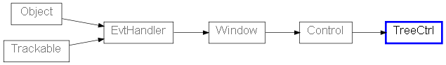
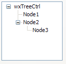
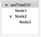
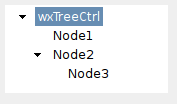
 Control Appearance