buttonpanel
A custom panel class with gradient background shading with the possibility to add buttons and controls still respecting the gradient background.
With ButtonPanel class you have a panel with gradient colouring on it and with the possibility to place some buttons on it. Using a standard panel with normal Buttons leads to an ugly result: the buttons are placed correctly on the panel - but with grey area around them. Gradient colouring is kept behind the images - this was achieved due to the PNG format and the transparency of the bitmaps.
The image are functioning like a buttons and can be caught in your code using the usual:
self.Bind(wx.EVT_BUTTON, self.OnButton)
method.
The control is generic, and support theming (well, I tested it under Windows with the three defauls themes: grey, blue, silver and the classic look).
ButtonPanel supports 4 alignments: left, right, top, bottom, which have a different meaning and behavior with respect to Toolbar. The easiest thing is to try the demo to understand, but I’ll try to explain how it works.
CASE 1: ButtonPanel has a main caption text.
CASE 2: ButtonPanel has no main caption text.
Usage example:
import wx
import wx.lib.agw.buttonpanel as BP

class MyFrame(wx.Frame):

    def __init__(self, parent, id=-1, title="ButtonPanel", pos=wx.DefaultPosition,
                 size=(800, 600), style=wx.DEFAULT_FRAME_STYLE):

        wx.Frame.__init__(self, parent, id, title, pos, size, style)

        mainPanel = wx.Panel(self, -1)
        self.logtext = wx.TextCtrl(mainPanel, -1, "", style=wx.TE_MULTILINE)

        vSizer = wx.BoxSizer(wx.VERTICAL)
        mainPanel.SetSizer(vSizer)

        titleBar = BP.ButtonPanel(mainPanel, -1, "A Simple Test & Demo")

        btn1 = BP.ButtonInfo(titleBar, wx.NewId(), wx.Bitmap("png4.png", wx.BITMAP_TYPE_PNG))
        titleBar.AddButton(btn1)
        self.Bind(wx.EVT_BUTTON, self.OnButton, btn1)

        btn2 = BP.ButtonInfo(titleBar, wx.NewId(), wx.Bitmap("png3.png", wx.BITMAP_TYPE_PNG))
        titleBar.AddButton(btn2)
        self.Bind(wx.EVT_BUTTON, self.OnButton, btn2)

        btn3 = BP.ButtonInfo(titleBar, wx.NewId(), wx.Bitmap("png2.png", wx.BITMAP_TYPE_PNG))
        titleBar.AddButton(btn3)
        self.Bind(wx.EVT_BUTTON, self.OnButton, btn3)

        btn4 = BP.ButtonInfo(titleBar, wx.NewId(), wx.Bitmap("png1.png", wx.BITMAP_TYPE_PNG))
        titleBar.AddButton(btn4)
        self.Bind(wx.EVT_BUTTON, self.OnButton, btn4)

        vSizer.Add(titleBar, 0, wx.EXPAND)
        vSizer.Add((20, 20))
        vSizer.Add(self.logtext, 1, wx.EXPAND|wx.ALL, 5)

        titleBar.DoLayout()
        vSizer.Layout()


    def OnButton(self, event):
        ''' Handler for the ``EVT_BUTTON``    event. '''

        obj = event.GetEventObject()

        # This will print the button label
        print obj.GetText()


# our normal wxApp-derived class, as usual

app = wx.App(0)

frame = MyFrame(None)
app.SetTopWindow(frame)
frame.Show()

app.MainLoop()
This class supports the following window styles:
| Window Styles | Hex Value | Description |
|---|---|---|
| BP_DEFAULT_STYLE | 0x1 | ButtonPanel has a plain solid background. |
| BP_USE_GRADIENT | 0x2 | ButtonPanel has a gradient shading background. |
This class processes the following events:
| Event Name | Description |
|---|---|
| EVT_BUTTON | Process a wxEVT_COMMAND_BUTTON_CLICKED event, when a button is clicked. |
ButtonPanel is distributed under the wxPython license.
Latest Revision: Andrea Gavana @ 17 Aug 2011, 15.00 GMT
Version 0.6.
 Functions Summary
| BrightenColour | Brighten the input colour by a factor. |
| MakeDisabledBitmap | Creates a disabled-looking bitmap starting from the input one. |
 Classes Summary
| BoxSizer | Pseudo-class that imitates BoxSizer. |
| BPArt | BPArt is an art provider class which does all of the drawing for ButtonPanel. |
| ButtonInfo | This class holds information about every button that is added to |
| ButtonPanel | A custom panel class with gradient background shading with the possibility to |
| ButtonPanelText | This class is used to hold data about the main caption in ButtonPanel. |
| Control | This class represents a base class for all pseudo controls used in |
| Separator | This class holds all the information to size and draw a separator inside |
| Sizer | This is a mix-in class to add pseudo support to Sizer. Just create |
| StatusBarTimer | Timer used for deleting StatusBar long help after _DELAY seconds. |


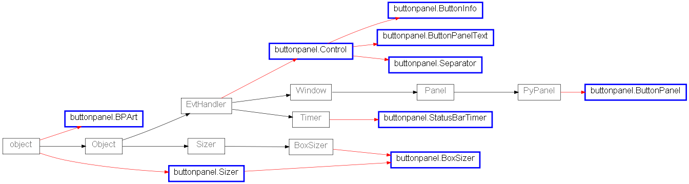
 Inheritance Diagram