buttons
This module implements various forms of generic buttons, meaning that they are not built on native controls but are self-drawn. They act like normal buttons but you are able to better control how they look, bevel width, colours, etc.
 Classes Summary
| __ThemedMixin | Use the native renderer to draw the bezel, also handle mouse-overs |
| __ToggleMixin | |
| GenBitmapButton | A generic bitmap button. |
| GenBitmapTextButton | A generic bitmapped button with text label |
| GenBitmapTextToggleButton | A generic toggle bitmap button with text label |
| GenBitmapToggleButton | A generic toggle bitmap button |
| GenButton | A generic button, and base class for the other generic buttons. |
| GenButtonEvent | Event sent from the generic buttons when the button is activated. |
| GenToggleButton | A generic toggle button |
| ThemedGenBitmapButton | A themed generic bitmap button. |
| ThemedGenBitmapTextButton | A themed generic bitmapped button with text label |
| ThemedGenBitmapTextToggleButton | A themed generic toggle bitmap button with text label |
| ThemedGenBitmapToggleButton | A themed generic toggle bitmap button |
| ThemedGenButton | A themed generic button |
| ThemedGenToggleButton | A themed generic toggle button |


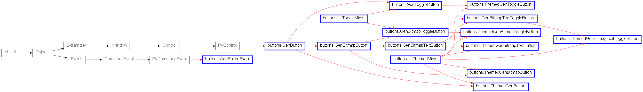
 Inheritance Diagram