 ColourPickerCtrl
This control allows the user to select a colour.
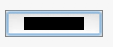
The generic implementation is a button which brings up a ColourDialog when clicked. Native implementation may differ but this is usually a (small) widget which give access to the colour-chooser dialog. It is only available if USE_COLOURPICKERCTRL is set to 1 (the default).
 Window Styles
This class supports the following styles:
 Events Emitted by this Class
Handlers bound for the following event types will receive a ColourPickerEvent parameter.
See also
 Methods Summary
| __init__ | |
| Create | Creates a colour picker with the given arguments. |
| GetColour | Returns the currently selected colour. |
| SetColour | Sets the currently selected colour. |
 Class API
This control allows the user to select a colour.
Possible constructors:
ColourPickerCtrl()

ColourPickerCtrl(parent, id=ID_ANY, colour=BLACK, pos=DefaultPosition,
                 size=DefaultSize, style=CLRP_DEFAULT_STYLE, validator=DefaultValidator,
                 name=ColourPickerCtrlNameStr)
 Overloaded Implementations:
__init__ (self)
__init__ (self, parent, id=ID_ANY, colour=BLACK, pos=DefaultPosition, size=DefaultSize, style=CLRP_DEFAULT_STYLE, validator=DefaultValidator, name=ColourPickerCtrlNameStr)
Initializes the object and calls Create with all the parameters.
| Parameters: |
|---|
Creates a colour picker with the given arguments.
| Parameters: |
|
|---|---|
| Return type: | bool |
| Returns: | True if the control was successfully created or False if creation failed. |
Sets the currently selected colour.
See Colour.Set .
Overloaded Implementations:
SetColour (self, col)
| Parameters: | col (Colour) – |
|---|
SetColour (self, colname)
| Parameters: | colname (string) – |
|---|


 Inheritance Diagram
 Control Appearance

 Properties Summary