 ComboBox
A combobox is like a combination of an edit control and a listbox.
It can be displayed as static list with editable or read-only text field; or a drop-down list with text field; or a drop-down list without a text field depending on the platform and presence of CB_READONLY style.
A combobox permits a single selection only. Combobox items are numbered from zero.
If you need a customized combobox, have a look at ComboCtrl, OwnerDrawnComboBox, ComboPopup and the ready-to-use BitmapComboBox.
Please refer to TextEntry documentation for the description of methods operating with the text entry part of the combobox and to ItemContainer for the methods operating with the list of strings. Notice that at least under MSW ComboBox doesn’t behave correctly if it contains strings differing in case only so portable programs should avoid adding such strings to this control.
 Window Styles
This class supports the following styles:
 Events Emitted by this Class
Handlers bound for the following event types will receive a CommandEvent parameter.
See also
 Methods Summary
| __init__ | Default constructor. |
| Create | Creates the combobox for two-step construction. |
| Dismiss | Hides the list box portion of the combo box. |
| FindString | Finds an item whose label matches the given string. |
| GetCount | Returns the number of items in the control. |
| GetCurrentSelection | Returns the item being selected right now. |
| GetInsertionPoint | Same as TextEntry.GetInsertionPoint . |
| GetSelection | Returns the index of the selected item or NOT_FOUND if no item is selected. |
| GetString | Returns the label of the item with the given index. |
| GetStringSelection | Gets the text currently selected in the control. |
| IsListEmpty | Returns True if the list of combobox choices is empty. |
| IsTextEmpty | Returns True if the text of the combobox is empty. |
| Popup | Shows the list box portion of the combo box. |
| SetSelection | Same as TextEntry.SetSelection . |
| SetString | Changes the text of the specified combobox item. |
| SetValue | Sets the text for the combobox text field. |
 Properties Summary
| Count | See GetCount |
| CurrentSelection | See GetCurrentSelection |
| InsertionPoint | See GetInsertionPoint |
| Selection | See GetSelection and SetSelection |
| StringSelection | See GetStringSelection |
 Class API
A combobox is like a combination of an edit control and a listbox.
Possible constructors:
ComboBox()

ComboBox(parent, id=ID_ANY, value='', pos=DefaultPosition,
         size=DefaultSize, choices=[], style=0,
         validator=DefaultValidator, name=ComboBoxNameStr)
 Overloaded Implementations:
__init__ (self)
Default constructor.
__init__ (self, parent, id=ID_ANY, value=’‘, pos=DefaultPosition, size=DefaultSize, choices=[], style=0, validator=DefaultValidator, name=ComboBoxNameStr)
Constructor, creating and showing a combobox.
| Parameters: |
|
|---|
Creates the combobox for two-step construction.
Derived classes should call or replace this function. See ComboBox for further details.
Hides the list box portion of the combo box.
Currently this method is implemented in wxMSW, wxGTK and OSX/Cocoa.
Notice that calling this function will generate a wxEVT_COMMAND_COMBOBOX_CLOSEUP event except under wxOSX where generation of this event is not supported at all.
New in version 2.9.1.
Finds an item whose label matches the given string.
| Parameters: |
|
|---|---|
| Return type: | int |
| Returns: | The zero-based position of the item, or NOT_FOUND if the string was not found. |
Returns the number of items in the control.
| Return type: | int |
|---|
See also
IsEmpty
Returns the item being selected right now.
This function does the same things as Choice.GetCurrentSelection and returns the item currently selected in the dropdown list if it’s open or the same thing as ControlWithItems.GetSelection otherwise.
| Return type: | int |
|---|
Same as TextEntry.GetInsertionPoint .
| Return type: | long |
|---|
Note
Under wxMSW, this function always returns 0 if the combobox doesn’t have the focus.
Returns the index of the selected item or NOT_FOUND if no item is selected.
| Returns: | The position of the current selection. |
|---|
Note
This method can be used with single selection list boxes only, you should use ListBox.GetSelections for the list boxes with LB_MULTIPLE style.
See also
Returns the label of the item with the given index.
| Parameters: | n (int) – The zero-based index. |
|---|---|
| Return type: | string |
| Returns: | The label of the item or an empty string if the position was invalid. |
Gets the text currently selected in the control.
If there is no selection, the returned string is empty.
| Return type: | string |
|---|
Returns True if the list of combobox choices is empty.
Use this method instead of (not available in this class) IsEmpty to test if the list of items is empty.
| Return type: | bool |
|---|
New in version 2.9.3.
Returns True if the text of the combobox is empty.
Use this method instead of (not available in this class) IsEmpty to test if the text currently entered into the combobox is empty.
| Return type: | bool |
|---|
New in version 2.9.3.
Shows the list box portion of the combo box.
Currently this method is implemented in wxMSW, wxGTK and OSX/Cocoa.
Notice that calling this function will generate a wxEVT_COMMAND_COMBOBOX_DROPDOWN event except under wxOSX where generation of this event is not supported at all.
New in version 2.9.1.
Overloaded Implementations:
SetSelection (self, from, to)
Same as TextEntry.SetSelection .
| Parameters: |
|
|---|
SetSelection (self, n)
Sets the selection to the given item n or removes the selection entirely if n == NOT_FOUND .
Note that this does not cause any command events to be emitted nor does it deselect any other items in the controls which support multiple selections.
| Parameters: | n (int) – The string position to select, starting from zero. |
|---|
See also
SetString , SetStringSelection
Changes the text of the specified combobox item.
Notice that if the item is the currently selected one, i.e. if its text is displayed in the text part of the combobox, then the text is also replaced with the new text.
| Parameters: |
|
|---|
Sets the text for the combobox text field.
Notice that this method will generate a wxEVT_COMMAND_TEXT_UPDATED event, use TextEntry.ChangeValue if this is undesirable.
| Parameters: | text (string) – The text to set. |
|---|
Note
For a combobox with CB_READONLY style the string must be in the combobox choices list, otherwise the call to SetValue is ignored. This is case insensitive.
See GetSelection and SetSelection


 Inheritance Diagram
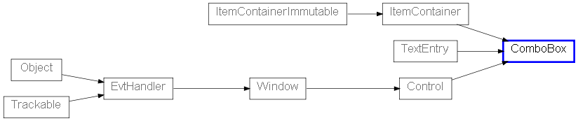
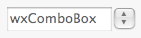
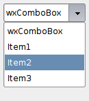
 Control Appearance
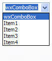
 Known Subclasses