 ToggleButton
ToggleButton is a button that stays pressed when clicked by the user.
In other words, it is similar to CheckBox in functionality but looks like a Button.
Since wxWidgets version 2.9.0 this control emits an update UI event.
You can see ToggleButton in action in .
 Events Emitted by this Class
Handlers bound for the following event types will receive a CommandEvent parameter.
See also
 Methods Summary
| __init__ | Default constructor. |
| Create | Creates the toggle button for two-step construction. |
| GetValue | Gets the state of the toggle button. |
| SetValue | Sets the toggle button to the given state. |
 Class API
ToggleButton is a button that stays pressed when clicked by the user.
Possible constructors:
ToggleButton()

ToggleButton(parent, id=ID_ANY, label='', pos=DefaultPosition,
             size=DefaultSize, style=0, val=DefaultValidator, name=CheckBoxNameStr)
 Overloaded Implementations:
__init__ (self)
Default constructor.
__init__ (self, parent, id=ID_ANY, label=’‘, pos=DefaultPosition, size=DefaultSize, style=0, val=DefaultValidator, name=CheckBoxNameStr)
Constructor, creating and showing a toggle button.
| Parameters: |
|
|---|
Creates the toggle button for two-step construction.
See ToggleButton for details.
| Parameters: | |
|---|---|
| Return type: | bool |
Gets the state of the toggle button.
| Return type: | bool |
|---|---|
| Returns: | Returns True if it is pressed, False otherwise. |
Sets the toggle button to the given state.
This does not cause a EVT_TOGGLEBUTTON event to be emitted.
| Parameters: | state (bool) – If True, the button is pressed. |
|---|

 Inheritance Diagram
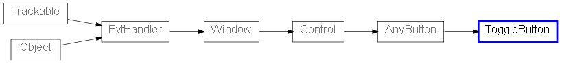
 Control Appearance


 Known Subclasses
 Properties Summary