Sizers Overview
Sizers, as represented by the Sizer class and its descendants in the wxPython class hierarchy, have become the method of choice to define the layout of controls in dialogs in wxPython because of their ability to create visually appealing dialogs independent of the platform, taking into account the differences in size and style of the individual controls. Editors such as wxDesigner, DialogBlocks, XRCed and wxWorkshop create dialogs based exclusively on sizers, practically forcing the user to create platform independent layouts without compromises.
The next section describes and shows what can be done with sizers. The following sections briefly describe how to program with individual sizer classes.
The layout algorithm used by sizers in wxPython is closely related to layout systems in other GUI toolkits, such as Java’s AWT, the GTK toolkit or the Qt toolkit. It is based upon the idea of individual subwindows reporting their minimal required size and their ability to get stretched if the size of the parent window has changed. This will most often mean that the programmer does not set the start-up size of a dialog, the dialog will rather be assigned a sizer and this sizer will be queried about the recommended size. This sizer in turn will query its children (which can be normal windows, empty space or other sizers) so that a hierarchy of sizers can be constructed. Note that Sizer does not derive from Window and thus does not interfere with tab ordering and requires very few resources compared to a real window on screen.
What makes sizers so well fitted for use in wxPython is the fact that every control reports its own minimal size and the algorithm can handle differences in font sizes or different window (dialog item) sizes on different platforms without problems. For example, if the standard font as well as the overall design of Linux/GTK widgets requires more space than on Windows, the initial dialog size will automatically be bigger on Linux/GTK than on Windows.
There are currently five different kinds of sizers available in wxPython. Each represents either a certain way to lay out dialog items in a dialog or it fulfills a special task such as wrapping a static box around a dialog item (or another sizer). These sizers will be discussed one by one in the text below. For more detailed information on how to use sizers programmatically, please refer to the section Programming with BoxSizer.
All sizers are containers, that is, they are used to lay out one dialog item (or several dialog items), which they contain. Such items are sometimes referred to as the children of the sizer. Independent of how the individual sizers lay out their children, all children have certain features in common:
A minimal size: This minimal size is usually identical to the initial size of the controls and may either be set explicitly in the Size field of the control constructor or may be calculated by wxPython, typically by setting the height and/or the width of the item to -1. Note that only some controls can calculate their size (such as a checkbox) whereas others (such as a listbox) don’t have any natural width or height and thus require an explicit size. Some controls can calculate their height, but not their width (e.g. a single line text control):
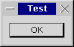
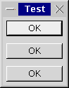
A border: The border is just empty space and is used to separate dialog items in a dialog. This border can either be all around, or at any combination of sides such as only above and below the control. The thickness of this border must be set explicitly, typically 5 points. The following samples show dialogs with only one dialog item (a button) and a border of 0, 5, and 10 pixels around the button:
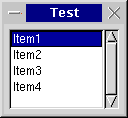
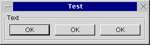
An alignment: Often, a dialog item is given more space than its minimal size plus its border. Depending on what flags are used for the respective dialog item, the dialog item can be made to fill out the available space entirely, i.e. it will grow to a size larger than the minimal size, or it will be moved to either the centre of the available space or to either side of the space. The following sample shows a listbox and three buttons in a horizontal box sizer; one button is centred, one is aligned at the top, one is aligned at the bottom:
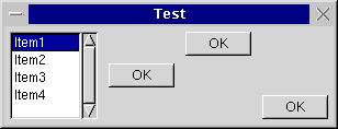
A stretch factor: If a sizer contains more than one child and it is offered more space than its children and their borders need, the question arises how to distribute the surplus space among the children. For this purpose, a stretch factor may be assigned to each child, where the default value of 0 indicates that the child will not get more space than its requested minimum size. A value of more than zero is interpreted in relation to the sum of all stretch factors in the children of the respective sizer, i.e. if two children get a stretch factor of 1, they will get half the extra space each independent of whether one control has a minimal sizer inferior to the other or not. The following sample shows a dialog with three buttons, the first one has a stretch factor of 1 and thus gets stretched, whereas the other two buttons have a stretch factor of zero and keep their initial width:
Within wxDesigner, this stretch factor gets set from the Option menu.
You can hide controls contained in sizers the same way you would hide any control, using the Window.Show method. However, Sizer also offers a separate method which can tell the sizer not to consider that control in its size calculations. To hide a window using the sizer, call Sizer.Show. You must then call Layout on the sizer to force an update.
This is useful when hiding parts of the interface, since you can avoid removing the controls from the sizer and having to add them back later.
Note
This is supported only by BoxSizer and FlexGridSizer.
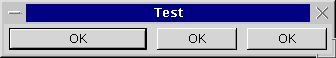
BoxSizer can lay out its children either vertically or horizontally, depending on what flag is being used in its constructor. When using a vertical sizer, each child can be centered, aligned to the right or aligned to the left. Correspondingly, when using a horizontal sizer, each child can be centered, aligned at the bottom or aligned at the top. The stretch factor described in the last paragraph is used for the main orientation, i.e. when using a horizontal box sizer, the stretch factor determines how much the child can be stretched horizontally. The following sample shows the same dialog as in the last sample, only the box sizer is a vertical box sizer now:
StaticBoxSixer is the same as a BoxSizer, but surrounded by a static box. Here is a sample:
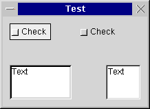
GridSizer is a two-dimensional sizer. All children are given the same size, which is the minimal size required by the biggest child, in this case the text control in the left bottom border. Either the number of columns or the number or rows is fixed and the grid sizer will grow in the respectively other orientation if new children are added:
For programming information, see GridSizer.
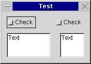
Another two-dimensional sizer derived from GridSizer. The width of each column and the height of each row are calculated individually according to the minimal requirements from the respectively biggest child. Additionally, columns and rows can be declared to be stretchable if the sizer is assigned a size different from the one it requested. The following sample shows the same dialog as the one above, but using a flex grid sizer:
The basic idea behind a BoxSizer is that windows will most often be laid out in rather simple basic geometry, typically in a row or a column or several hierarchies of either.
As an example, we will construct a dialog that will contain a text field at the top and two buttons at the bottom. This can be seen as a top-hierarchy column with the text at the top and buttons at the bottom and a low-hierarchy row with an OK button to the left and a Cancel button to the right. In many cases (particularly dialogs under Unix and normal frames) the main window will be resizable by the user and this change of size will have to get propagated to its children. In our case, we want the text area to grow with the dialog, whereas the button shall have a fixed size. In addition, there will be a thin border around all controls to make the dialog look nice and - to make matter worse - the buttons shall be centred as the width of the dialog changes.
It is the unique feature of a box sizer, that it can grow in both directions (height and width) but can distribute its growth in the main direction (horizontal for a row) unevenly among its children. In our example case, the vertical sizer is supposed to propagate all its height changes to only the text area, not to the button area. This is determined by the proportion parameter when adding a window (or another sizer) to a sizer. It is interpreted as a weight factor, i.e. it can be zero, indicating that the window may not be resized at all, or above zero. If several windows have a value above zero, the value is interpreted relative to the sum of all weight factors of the sizer, so when adding two windows with a value of 1, they will both get resized equally much and each half as much as the sizer owning them. Then what do we do when a column sizer changes its width? This behaviour is controlled by flags (the second parameter of the Add() function): Zero or no flag indicates that the window will preserve it is original size, GROW flag (same as EXPAND) forces the window to grow with the sizer, and SHAPED flag tells the window to change it is size proportionally, preserving original aspect ratio. When GROW flag is not used, the item can be aligned within available space. ALIGN_LEFT, ALIGN_TOP, ALIGN_RIGHT, ALIGN_BOTTOM, ALIGN_CENTER_HORIZONTAL and ALIGN_CENTER_VERTICAL do what they say. ALIGN_CENTRE (same as ALIGN_CENTER) is defined as (ALIGN_CENTER_HORIZONTAL | ALIGN_CENTER_VERTICAL). Default alignment is ALIGN_LEFT | ALIGN_TOP.
As mentioned above, any window belonging to a sizer may have a border, and it can be specified which of the four sides may have this border, using the TOP, LEFT, RIGHT and BOTTOM constants or ALL for all directions (and you may also use NORTH, WEST etc instead). These flags can be used in combination with the alignment flags above as the second parameter of the Add() method using the binary or operator |. The sizer of the border also must be made known, and it is the third parameter in the Add() method. This means, that the entire behaviour of a sizer and its children can be controlled by the three parameters of the Add() method.
Example:
# We want to get a dialog that is stretchable because it
# has a text ctrl at the top and two buttons at the bottom.

class MyDialog(wx.Dialog):

    def __init__(self, parent, id, title):

        wx.Dialog(parent, id, title, wx.DefaultPosition, wx.DefaultSize,
                  wx.DEFAULT_DIALOG_STYLE | wx.RESIZE_BORDER)

        topsizer = wx.BoxSizer(wx.VERTICAL)

        # create text ctrl with minimal size 100x60
        topsizer.Add(
                wx.TextCtrl(self, -1, "My text.", wx.DefaultPosition, wx.Size(100,60), wx.TE_MULTILINE),
                1,           # make vertically stretchable
                wx.EXPAND |  # make horizontally stretchable
                wx.ALL,      # and make border all around
                10)          # set border width to 10

        button_sizer = wx.BoxSizer(wx.HORIZONTAL)
        button_sizer.Add(
                wx.Button(self, wx.ID_OK, "OK"),
                0,           # make horizontally unstretchable
                wx.ALL,      # make border all around (implicit top alignment)
                10)          # set border width to 10
        button_sizer.Add(
                wx.Button(self, wx.ID_CANCEL, "Cancel"),
                0,           # make horizontally unstretchable
                wx.ALL,      # make border all around (implicit top alignment)
                10)          # set border width to 10

        topsizer.Add(
                button_sizer,
                0,                # make vertically unstretchable
                wx.ALIGN_CENTER)  # no border and centre horizontally

        self.SetSizerAndFit(topsizer) # use the sizer for layout and size window
                                      # accordingly and prevent it from being resized
                                      # to smaller size
Note that the new way of specifying flags to Sizer is via SizerFlags. This class greatly eases the burden of passing flags to a Sizer.
Here’s how you’d do the previous example with SizerFlags:
# We want to get a dialog that is stretchable because it
# has a text ctrl at the top and two buttons at the bottom.

class MyDialog(wx.Dialog):

    def __init__(self, parent, id, title):

        wx.Dialog(parent, id, title, wx.DefaultPosition, wx.DefaultSize,
                  wx.DEFAULT_DIALOG_STYLE | wx.RESIZE_BORDER)

        topsizer = wx.BoxSizer(wx.VERTICAL)

        # create text ctrl with minimal size 100x60
        topsizer.Add(
                wx.TextCtrl(self, -1, "My text.", wx.DefaultPosition, wx.Size(100,60), wx.TE_MULTILINE),
                wx.SizerFlags(1).Align().Expand().Border(wx.ALL, 10))

        button_sizer = wx.BoxSizer(wx.HORIZONTAL)
        button_sizer.Add(
                wx.Button(self, wx.ID_OK, "OK"),
                wx.SizerFlags(0).Align().Border(wx.ALL, 10))

        button_sizer.Add(
                wx.Button(self, wx.ID_CANCEL, "Cancel"),
                wx.SizerFlags(0).Align().Border(wx.ALL, 10))

        topsizer.Add(
                button_sizer,
                wx.SizerFlags(0).Center())

        self.SetSizerAndFit(topsizer) # use the sizer for layout and set size and hints
GridSizer is a sizer which lays out its children in a two-dimensional table with all table fields having the same size, i.e. the width of each field is the width of the widest child, the height of each field is the height of the tallest child.
FlexGridSizer is a sizer which lays out its children in a two-dimensional table with all table fields in one row having the same height and all fields in one column having the same width, but all rows or all columns are not necessarily the same height or width as in the GridSizer.
StaticBoxSizer is a sizer derived from BoxSizer but adds a static box around the sizer. Note that this static box has to be created separately.
GridBagSizer is a rather special kind of sizer which, unlike the other classes, allows to directly put the elements at the given position in the sizer. Please see its documentation for more details.
As a convenience, Dialog.CreateButtonSizer (flags) can be used to create a standard button sizer in which standard buttons are displayed. The following flags can be passed to this method:
wx.YES_NO     # Add Yes/No subpanel
wx.YES        # return wx.ID_YES
wx.NO         # return wx.ID_NO
wx.NO_DEFAULT # make the wx.NO button the default,
              # otherwise wx.YES or wx.OK button will be default

wx.OK         # return wx.ID_OK
wx.CANCEL     # return wx.ID_CANCEL
wx.HELP       # return wx.ID_HELP

wx.FORWARD    # return wx.ID_FORWARD
wx.BACKWARD   # return wx.ID_BACKWARD
wx.SETUP      # return wx.ID_SETUP
wx.MORE       # return wx.ID_MORE