Inheritance diagram for wx.TreeCtrl:

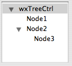
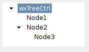
A tree control presents information as a hierarchy, with items that may be expanded to show further items. Items in a tree control are referenced by wx.TreeItemId handles, which may be tested for validity by calling wx.TreeItemId.IsOk.
To intercept events from a tree control, use the event table macros described in wx.TreeEvent.
Note
Win32 note: wx.TreeCtrl class uses the standard common treeview control under Win32 implemented in the system library comctl32.dll. Some versions of this library are known to have bugs with handling the tree control colours: the usual symptom is that the expanded items leave black (or otherwise incorrectly coloured) background behind them, especially for the controls using non-default background colour. The recommended solution is to upgrade the comctl32.dll to a newer version: see http://www.microsoft.com/downloads/release.asp?ReleaseID=11916.
See also
wx.TreeItemData, wx.ListBox, wx.ListCtrl, wx.ImageList, wx.TreeEvent
| Window Style | Description |
|---|---|
| wx.TR_EDIT_LABELS | Use this style if you wish the user to be able to edit labels in the tree control. |
| wx.TR_NO_BUTTONS | For convenience to document that no buttons are to be drawn. |
| wx.TR_HAS_BUTTONS | Use this style to show + and - buttons to the left of parent items. |
| wx.TR_NO_LINES | Use this style to hide vertical level connectors. |
| wx.TR_FULL_ROW_HIGHLIGHT | Use this style to have the background colour and the selection highlight extend over the entire horizontal row of the tree control window. (This flag is ignored under Windows unless you specify wx.TR_NO_LINES as well.) |
| wx.TR_LINES_AT_ROOT | Use this style to show lines between root nodes. Only applicable if wx.TR_HIDE_ROOT is set and wx.TR_NO_LINES is not set. |
| wx.TR_HIDE_ROOT | Use this style to suppress the display of the root node, effectively causing the first-level nodes to appear as a series of root nodes. |
| wx.TR_ROW_LINES | Use this style to draw a contrasting border between displayed rows. |
| wx.TR_HAS_VARIABLE_ROW_HEIGHT | Use this style to cause row heights to be just big enough to fit the content. If not set, all rows use the largest row height. The default is that this flag is unset. Generic only. |
| wx.TR_SINGLE | For convenience to document that only one item may be selected at a time. Selecting another item causes the current selection, if any, to be deselected. This is the default. |
| wx.TR_MULTIPLE | Use this style to allow a range of items to be selected. If a second range is selected, the current range, if any, is deselected. |
| wx.TR_EXTENDED | Use this style to allow disjoint items to be selected. (Only partially implemented; may not work in all cases.) |
| wx.TR_DEFAULT_STYLE | The set of flags that are closest to the defaults for the native control for a particular toolkit. |
| Event Name | Description |
|---|---|
| wx.EVT_TREE_BEGIN_DRAG(id, func) | Begin dragging with the left mouse button. |
| wx.EVT_TREE_BEGIN_RDRAG(id, func) | Begin dragging with the right mouse button. |
| wx.EVT_TREE_END_DRAG(id, func) | End dragging with the left or right mouse button. |
| wx.EVT_TREE_BEGIN_LABEL_EDIT(id, func) | Begin editing a label. This can be prevented by calling Veto. |
| wx.EVT_TREE_END_LABEL_EDIT(id, func) | Finish editing a label. This can be prevented by calling Veto. |
| wx.EVT_TREE_DELETE_ITEM(id, func) | Delete an item. |
| wx.EVT_TREE_GET_INFO(id, func) | Request information from the application. |
| wx.EVT_TREE_SET_INFO(id, func) | Information is being supplied. |
| wx.EVT_TREE_ITEM_ACTIVATED(id, func) | The item has been activated, i.e. chosen by double clicking it with mouse or from keyboard |
| wx.EVT_TREE_ITEM_COLLAPSED(id, func) | The item has been collapsed. |
| wx.EVT_TREE_ITEM_COLLAPSING(id, func) | The item is being collapsed. This can be prevented by calling Veto. |
| wx.EVT_TREE_ITEM_EXPANDED(id, func) | The item has been expanded. |
| wx.EVT_TREE_ITEM_EXPANDING(id, func) | The item is being expanded. This can be prevented by calling Veto. |
| wx.EVT_TREE_ITEM_RIGHT_CLICK(id, func) | The user has clicked the item with the right mouse button. |
| wx.EVT_TREE_ITEM_MIDDLE_CLICK(id, func) | The user has clicked the item with the middle mouse button. |
| wx.EVT_TREE_SEL_CHANGED(id, func) | Selection has changed. |
| wx.EVT_TREE_SEL_CHANGING(id, func) | Selection is changing. This can be prevented by calling Veto. |
| wx.EVT_TREE_KEY_DOWN(id, func) | A key has been pressed. |
| wx.EVT_TREE_ITEM_GETTOOLTIP(id, func) | The opportunity to set the item tooltip is being given to the application (call wx.TreeEvent.SetToolTip). Windows only. |
| wx.EVT_TREE_ITEM_MENU(id, func) | The context menu for the selected item has been requested, either by a right click or by using the menu key. |
| wx.EVT_TREE_STATE_IMAGE_CLICK(id, func) | The state image has been clicked. Windows only. |
Constructor, creating and showing a tree control.
Parameters:
Returns:
Adds the root node to the tree, returning the new item.
The image and selImage parameters are an index within the normal image list specifying the image to use for unselected and selected items, respectively. If image > -1 and selImage is -1, the same image is used for both selected and unselected items.
Parameters:
Returns:
Appends an item to the end of the branch identified by parent, return a new item id.
The image and selImage parameters are an index within the normal image list specifying the image to use for unselected and selected items, respectively. If image > -1 and selImage is -1, the same image is used for both selected and unselected items.
Parameters:
Returns:
Sets the normal image list. Image list assigned with this method will be automatically deleted by wx.TreeCtrl as appropriate (i.e. it takes ownership of the list).
Parameters:
See also
Sets the state image list. Image list assigned with this method will be automatically deleted by wx.TreeCtrl as appropriate (i.e. it takes ownership of the list).
Parameters:
See also
Collapses the given item.
Parameters:
See also
Collapses this item and all of its children, recursively.
Parameters:
See also
Collapses the given item and removes all children.
Parameters:
Deletes the specified item. A wx.EVT_TREE_DELETE_ITEM event will be generated. This function may cause a subsequent call to GetNextChild to fail.
Parameters:
Note
Note that this may not generate wx.EVT_TREE_DELETE_ITEM events under some Windows versions although normally such event is generated for each removed item.
Deletes all children of the given item (but not the item itself).
If you have called SetItemHasChildren, you may need to call it again since DeleteChildren does not automatically clear the setting.
Parameters:
Note
Note that this will not generate any events unlike Delete method.
Starts editing the label of the given item. This function generates a wx.EVT_TREE_BEGIN_LABEL_EDIT event which can be vetoed so that no text control will appear for in-place editing.
If the user changed the label (i.e. s/he does not press ESC or leave the text control without changes, a wx.EVT_TREE_END_LABEL_EDIT event will be sent which can be vetoed as well.
Parameters:
See also
Ends label editing. If cancelEdit is True, the edit will be cancelled.
Parameters:
Note
This function is currently supported under Windows only.
See also
Scrolls and/or expands items to ensure that the given item is visible.
Parameters:
Expands the given item.
Parameters:
Expands the given item and all its children recursively.
Parameters:
Retrieves the rectangle bounding the item. If textOnly is True, only the rectangle around the item’s label will be returned, otherwise the item’s image is also taken into account.
Parameters:
Returns:
Note
Notice that the rectangle coordinates are logical, not physical ones. So, for example, the x coordinate may be negative if the tree has a horizontal scrollbar and its position is not 0.
Returns the number of items in the branch. If recursively is True, returns the total number of descendants, otherwise only one level of children is counted.
Parameters:
Returns:
int
Returns the number of items in the control.
Returns:
int
Returns the edit control being currently used to edit a label. Returns None if no label is being edited.
Returns:
Note
It is currently only implemented for wxMSW.
Returns the first child; call GetNextChild for the next child.
Returns an invalid tree item (i.e. IsOk() returns False) if there are no further children.
Parameters:
Returns:
See also
Returns the first visible item.
Returns:
Returns the normal image list.
Returns:
Returns the current tree control indentation.
Returns:
int
Returns the background colour of the item.
Parameters:
Returns:
Returns the font of the item.
Parameters:
Returns:
Gets the specified item image. The value of which may be:
Parameters:
Returns:
int
Returns the item’s parent.
Parameters:
Returns:
Returns the tree item data associated with the item. Same as GetPyData
Parameters:
Returns:
PyObject
Returns the item label.
Parameters:
Returns:
string
Returns the colour of the item label.
Parameters:
Returns:
Returns the last child of the item (or an invalid tree item if this item has no children).
Parameters:
Returns:
See also
Returns the next child; call GetFirstChild for the first child.
For this enumeration function you must pass in a cookie parameter which is opaque for the application but is necessary for the library to make these functions reentrant (i.e. allow more than one enumeration on one and the same object simultaneously). The cookie returned by GetFirstChild and passed to GetNextChild should be the same.
Returns an invalid tree item if there are no further children.
Parameters:
Returns:
See also
Returns the next sibling of the specified item; call GetPrevSibling for the previous sibling.
Returns an invalid tree item if there are no further siblings.
Parameters:
Returns:
See also
Returns the next visible item.
Parameters:
Returns:
Returns the previous sibling of the specified item; call GetNextSibling for the next sibling.
Returns an invalid tree item if there are no further children.
Parameters:
Returns:
See also
Returns the previous visible item.
Parameters:
Returns:
Returns the tree item data associated with the item. Same as GetItemPyData.
Parameters:
Returns:
PyObject
Returns True if the control will use a quick calculation for the best size, looking only at the first and last items. The default is False.
Returns:
bool
See also
Returns the root item for the tree control.
Returns:
Returns the selection, or an invalid item if there is no selection. This function only works with the controls without wx.TR_MULTIPLE style, use GetSelections for the controls which do have this style.
Returns:
Returns an array of tree items passed in with the currently selected items. This function can be called only if the control has the wx.TR_MULTIPLE style.
Returns:
list of wx.TreeItemIds
Parameters:
Returns:
int
Returns the state image list (from which application-defined state images are taken).
Returns:
Calculates which (if any) item is under the given point, returning the tree item id at this point plus extra information flags.
flags is a bitlist of the following:
| HitTest Flag | Description |
|---|---|
| wx.TREE_HITTEST_ABOVE | Above the client area. |
| wx.TREE_HITTEST_BELOW | Below the client area. |
| wx.TREE_HITTEST_NOWHERE | In the client area but below the last item. |
| wx.TREE_HITTEST_ONITEMBUTTON | On the button associated with an item. |
| wx.TREE_HITTEST_ONITEMICON | On the bitmap associated with an item. |
| wx.TREE_HITTEST_ONITEMINDENT | In the indentation associated with an item. |
| wx.TREE_HITTEST_ONITEMLABEL | On the label (string) associated with an item. |
| wx.TREE_HITTEST_ONITEMRIGHT | In the area to the right of an item. |
| wx.TREE_HITTEST_ONITEMSTATEICON | On the state icon for a tree view item that is in a user-defined state. |
| wx.TREE_HITTEST_TOLEFT | To the right of the client area. |
| wx.TREE_HITTEST_TORIGHT | To the left of the client area. |
Parameters:
pt (wx.Point): The point at which perform the HitTest calculations
Returns:
(wx.TreeItemId, flags)
Inserts an item after a given one previous.
The image and selImage parameters are an index within the normal image list specifying the image to use for unselected and selected items, respectively. If image > -1 and selImage is -1, the same image is used for both selected and unselected items.
Parameters:
Returns:
Inserts an item after a given one before.
The image and selImage parameters are an index within the normal image list specifying the image to use for unselected and selected items, respectively. If image > -1 and selImage is -1, the same image is used for both selected and unselected items.
Parameters:
Returns:
Returns True if the given item is in bold state.
Parameters:
Returns:
bool
See also
Returns True if the control is empty (i.e. has no items, even no root one).
Returns:
bool
Returns True if the item is expanded (only makes sense if it has children).
Parameters:
Returns:
bool
Returns True if the item is selected.
Parameters:
Returns:
bool
Returns True if the item is visible (it might be outside the view, or not expanded).
Parameters:
Returns:
bool
Returns True if the item has children.
Parameters:
Returns:
bool
Appends an item as the first child of parent, return a new item id.
The image and selImage parameters are an index within the normal image list specifying the image to use for unselected and selected items, respectively. If image > -1 and selImage is -1, the same image is used for both selected and unselected items.
Parameters:
Returns:
Scrolls the specified item into view.
Parameters:
Selects the given item. In multiple selection controls, can be also used to deselect a currently selected item if the value of select is False.
Parameters:
Sets the normal image list. Image list assigned with this method will not be deleted by wx.TreeCtrl destructor, you must delete it yourself.
Parameters:
See also
Sets the indentation for the tree control.
Parameters:
Sets the colour of the item’s background.
Parameters:
Makes item appear in bold font if bold parameter is True or resets it to the normal state.
Parameters:
See also
Gives the item the visual feedback for Drag’n’Drop actions, which is useful if something is dragged from the outside onto the tree control (as opposed to a DnD operation within the tree control, which already is implemented internally).
Parameters:
Sets the item’s font. All items in the tree should have the same height to avoid text clipping, so the fonts height should be the same for all of them, although font attributes may vary.
Parameters:
See also
Force appearance of the button next to the item. This is useful to allow the user to expand the items which don’t have any children now, but instead adding them only when needed, thus minimizing memory usage and loading time.
Parameters:
Sets the specified item image. See GetItemImage for the description of the which parameter.
Parameters:
See also
Sets the item client data. Same as SetPyData.
Parameters:
Sets the item label.
Parameters:
Sets the colour of the item’s text.
Parameters:
Sets the item client data. Same as SetItemPyData.
Parameters:
If True is passed, specifies that the control will use a quick calculation for the best size, looking only at the first and last items. Otherwise, it will look at all items.
The default is False.
Parameters:
See also
Sets the spacing for the tree control items.
Parameters:
Parameters:
Sets the state image list (from which application-defined state images are taken). Image list assigned with this method will not be deleted by wx.TreeCtrl destructor, you must delete it yourself.
Parameters:
See also
Sorts the children of the given item using OnCompareItems method of wx.TreeCtrl.
You should override that method to change the sort order (the default is ascending case-sensitive alphabetical order).
A simple example of a OnCompareItems method may be:
def OnCompareItems(self, item1, item2):
    """ Overrides OnCompareItems in wx.TreeCtrl. Used by the SortChildren method. """

    # Get the item data
    data1 = GetSomeData(item1)
    data2 = GetSomeData(item2)

    # Compare the item data
    if data1 < data2:
        return -1
    elif data1 > data2:
        return 1
    else:
        return 0
Parameters:
See also
Toggles the given item between collapsed and expanded states.
Parameters:
Toggles the given item between selected and unselected states. For multiselection controls only.
Parameters:
Removes the selection from the currently selected item (if any).
Parameters:
Unselects the given item. This works in multiselection controls only.
Parameters: