Inheritance diagram for wx.combo.OwnerDrawnComboBox:

wx.combo.OwnerDrawnComboBox is a combobox with owner-drawn list items. In essence, it is a wx.combo.ComboCtrl with wx.VListBox popup and wx.ControlWithItems interface.
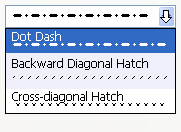
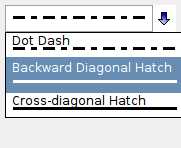
Implementing item drawing and measuring is similar to wx.VListBox. Application needs to subclass wx.combo.OwnerDrawnComboBox and implement OnDrawItem, OnMeasureItem and OnMeasureItemWidth.
See also
wx.combo.ComboCtrl, wx.ComboBox, wx.VListBox, wx.CommandEvent
| Window Style | Description |
|---|---|
| wx.combo.ODCB_DCLICK_CYCLES | Double-clicking cycles item if wx.CB_READONLY is also used. Synonymous with wx.combo.CC_SPECIAL_DCLICK. |
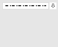
| wx.combo.ODCB_STD_CONTROL_PAINT | Control itself is not custom painted using OnDrawItem. Even if this style is not used, writable wx.combo.OwnerDrawnComboBox is never custom painted unless SetCustomPaintWidth is called. |
| Event Name | Description |
|---|---|
| wx.EVT_COMBOBOX(id, func) | Process a wx.wxEVT_COMMAND_COMBOBOX_SELECTED event, when an item on the list is selected. Note that calling GetValue returns the new value of selection. |
See also
See also events emitted by wx.combo.ComboCtrl
Standard constructor, creating and showing a owner-drawn combobox.
Parameters:
Returns:
Creates the combobox for two-step construction.
Derived classes should call or replace this function.
Parameters:
Returns:
bool
Returns index to the widest item in the list.
Returns:
int
Returns width of the widest item in the list.
Returns:
int
This method is used to draw the items background and, maybe, a border around it.
The base class version implements a reasonable default behaviour which consists in drawing the selected item with the standard background colour and drawing a border around the item if it is either selected or current.
Parameters:
Note
flags has the same meaning as with OnDrawItem
The derived class may implement this function to actually draw the item with the given index on the provided DC. If function is not implemented, the item text is simply drawn, as if the control was a normal combobox.
Parameters:
dc (wx.DC): The device context to use for drawing
rect (wx.Rect): The bounding rectangle for the item being drawn (DC clipping region is set to this rectangle before calling this function)
item (int): The index of the item to be drawn
flags (int): Combines any of the following flag values:
Painting Flags |
Description |
|---|---|
wx.ODCB_PAINTING_CONTROL |
Combo control is being painted, instead of a list item. Argument item may be wx.NOT_FOUND in this case. |
wx.ODCB_PAINTING_SELECTED |
An item with selection background is being painted. DC text colour should already be correct. |
The derived class may implement this method to return the height of the specified item (in pixels). The default implementation returns text height, as if this control was a normal combobox.
Parameters:
Returns:
int
The derived class may implement this method to return the width of the specified item (in pixels). If -1 is returned, then the item text width is used.
The default implementation returns -1.
Parameters:
Returns:
int