 AnyButton
A class for common button functionality used as the base for the various button classes.
 Methods Summary
| __init__ | |
| GetBitmap | Return the bitmap shown by the button. |
| GetBitmapCurrent | Returns the bitmap used when the mouse is over the button, which may be invalid. |
| GetBitmapDisabled | Returns the bitmap for the disabled state, which may be invalid. |
| GetBitmapFocus | Returns the bitmap for the focused state, which may be invalid. |
| GetBitmapLabel | Returns the bitmap for the normal state. |
| GetBitmapMargins | Get the margins between the bitmap and the text of the button. |
| GetBitmapPressed | Returns the bitmap for the pressed state, which may be invalid. |
| SetBitmap | Sets the bitmap to display in the button. |
| SetBitmapCurrent | Sets the bitmap to be shown when the mouse is over the button. |
| SetBitmapDisabled | Sets the bitmap for the disabled button appearance. |
| SetBitmapFocus | Sets the bitmap for the button appearance when it has the keyboard focus. |
| SetBitmapLabel | Sets the bitmap label for the button. |
| SetBitmapMargins | Set the margins between the bitmap and the text of the button. |
| SetBitmapPosition | Set the position at which the bitmap is displayed. |
| SetBitmapPressed | Sets the bitmap for the selected (depressed) button appearance. |
 Properties Summary
| Bitmap | See GetBitmap and SetBitmap |
| BitmapCurrent | See GetBitmapCurrent and SetBitmapCurrent |
| BitmapDisabled | See GetBitmapDisabled and SetBitmapDisabled |
| BitmapFocus | See GetBitmapFocus and SetBitmapFocus |
| BitmapLabel | See GetBitmapLabel and SetBitmapLabel |
| BitmapMargins | See GetBitmapMargins and SetBitmapMargins |
| BitmapPressed | See GetBitmapPressed and SetBitmapPressed |
 Class API
A class for common button functionality used as the base for the various button classes.
Possible constructors:
AnyButton()
Return the bitmap shown by the button.
The returned bitmap may be invalid only if the button doesn’t show any images.
| Return type: | Bitmap |
|---|
New in version 2.9.1.
See also
Returns the bitmap used when the mouse is over the button, which may be invalid.
| Return type: | Bitmap |
|---|
New in version 2.9.1: (available as BitmapButton.GetBitmapHover() in previous versions)
See also
Returns the bitmap for the disabled state, which may be invalid.
| Return type: | Bitmap |
|---|
New in version 2.9.1: (available in BitmapButton only in previous versions)
See also
Returns the bitmap for the focused state, which may be invalid.
| Return type: | Bitmap |
|---|
New in version 2.9.1: (available in BitmapButton only in previous versions)
See also
Returns the bitmap for the normal state.
This is exactly the same as GetBitmap but uses a name backwards-compatible with BitmapButton.
| Return type: | Bitmap |
|---|
New in version 2.9.1: (available in BitmapButton only in previous versions)
See also
Get the margins between the bitmap and the text of the button.
| Return type: | Size |
|---|
New in version 2.9.1.
See also
Returns the bitmap for the pressed state, which may be invalid.
| Return type: | Bitmap |
|---|
New in version 2.9.1: (available as BitmapButton.GetBitmapSelected() in previous versions)
See also
Sets the bitmap to display in the button.
The bitmap is displayed together with the button label. This method sets up a single bitmap which is used in all button states, use SetBitmapDisabled , SetBitmapPressed , SetBitmapCurrent or SetBitmapFocus to change the individual images used in different states.
| Parameters: |
|
|---|
New in version 2.9.1.
See also
Sets the bitmap to be shown when the mouse is over the button.
| Parameters: | bitmap (Bitmap) – |
|---|
New in version 2.9.1: (available as BitmapButton.SetBitmapHover() in previous versions)
See also
Sets the bitmap for the disabled button appearance.
| Parameters: | bitmap (Bitmap) – |
|---|
New in version 2.9.1: (available in BitmapButton only in previous versions)
See also
GetBitmapDisabled , SetBitmapLabel , SetBitmapPressed , SetBitmapFocus
Sets the bitmap for the button appearance when it has the keyboard focus.
| Parameters: | bitmap (Bitmap) – |
|---|
New in version 2.9.1: (available in BitmapButton only in previous versions)
See also
GetBitmapFocus , SetBitmapLabel , SetBitmapPressed , SetBitmapDisabled
Sets the bitmap label for the button.
| Parameters: | bitmap (Bitmap) – |
|---|
New in version 2.9.1: (available in BitmapButton only in previous versions)
Note
This is the bitmap used for the unselected state, and for all other states if no other bitmaps are provided.
See also
Set the margins between the bitmap and the text of the button.
This method is currently only implemented under MSW. If it is not called, default margin is used around the bitmap.
New in version 2.9.1.
See also
 Overloaded Implementations:
SetBitmapMargins (self, x, y)
| Parameters: |
|
|---|
SetBitmapMargins (self, sz)
| Parameters: | sz (Size) – |
|---|
Set the position at which the bitmap is displayed.
This method should only be called if the button does have an associated bitmap.
| Parameters: | dir (Direction) – Direction in which the bitmap should be positioned, one of LEFT, RIGHT, TOP or BOTTOM. |
|---|
New in version 2.9.1.
Sets the bitmap for the selected (depressed) button appearance.
| Parameters: | bitmap (Bitmap) – |
|---|
New in version 2.9.1: (available as BitmapButton.SetBitmapSelected() in previous versions)
See GetBitmapCurrent and SetBitmapCurrent
See GetBitmapDisabled and SetBitmapDisabled
See GetBitmapFocus and SetBitmapFocus
See GetBitmapLabel and SetBitmapLabel
See GetBitmapMargins and SetBitmapMargins
See GetBitmapPressed and SetBitmapPressed


 Inheritance Diagram
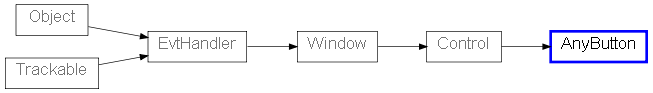
 Known Subclasses