CommandLinkButton
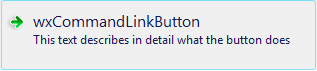
Objects of this class are similar in appearance to the normal Buttons but are similar to the links in a web page in functionality.
Pressing such button usually results in switching to another window of the program and so they can be used as a replacement for the “Next” button in a multi-page dialog (such as Wizard), for example.
Their advantage compared to the ordinary Buttons is that they emphasize the action of switching the window and also that they allow to give more detailed explanation to the user because, in addition to the short button label, they also show a longer description string.
The short, title-like, part of the label is called the main label and the longer description is the note. Both of them can be set and queried independently using CommandLinkButton-specific methods such as SetMainLabel or GetNote or also via SetLabel and GetLabel methods inherited from Button. When using the latter, the main label and the note are concatenated into a single string using a new line character between them (notice that the note part can have more new lines in it).
CommandLinkButton generates the same event as Button but doesn’t support any of Button-specific styles nor adds any new styles of its own.
Currently this class uses native implementation under Windows Vista and later versions and a generic implementation for the other platforms and earlier Windows versions.
New in version 2.9.2.
See also
 Methods Summary
| __init__ | Default constructor. |
| Create | Button creation function for two-step creation. |
| GetLabel | Returns the string label for the button. |
| GetMainLabel | Returns the current main label. |
| GetNote | Returns the currently used note. |
| SetLabel | Sets the string label and note for the button. |
| SetMainLabel | Changes the main label. |
| SetMainLabelAndNote | Sets a new main label and note for the button. |
| SetNote | Changes the note. |
 Properties Summary
| Label | See GetLabel and SetLabel |
| MainLabel | See GetMainLabel and SetMainLabel |
| Note | See GetNote and SetNote |
 Class API
Objects of this class are similar in appearance to the normal Buttons but are similar to the links in a web page in functionality.
Possible constructors:
CommandLinkButton()

CommandLinkButton(parent, id=ID_ANY, mainLabel='',
                  note='', pos=DefaultPosition, size=DefaultSize, style=0,
                  validator=DefaultValidator, name=ButtonNameStr)
 Overloaded Implementations:
__init__ (self)
Default constructor.
Use Create to really create the control.
__init__ (self, parent, id=ID_ANY, mainLabel=’‘, note=’‘, pos=DefaultPosition, size=DefaultSize, style=0, validator=DefaultValidator, name=ButtonNameStr)
Constructor really creating a command Link button.
The button will be decorated with stock icons under GTK+ 2.
| Parameters: |
|
|---|
Button creation function for two-step creation.
For more details, see CommandLinkButton .
| Parameters: | |
|---|---|
| Return type: | bool |
Returns the string label for the button.
| Return type: | string |
|---|---|
| Returns: | A string with the main label and note concatenated together with a newline separating them. |
See also
Returns the current main label.
| Return type: | string |
|---|---|
| Returns: | Main label currently displayed. |
Returns the currently used note.
| Return type: | string |
|---|---|
| Returns: | Note currently displayed. |
Sets the string label and note for the button.
| Parameters: | label (string) – The label and note to set, with the two separated by the first newline or none to set a blank note. |
|---|
Changes the main label.
| Parameters: | mainLabel (string) – New main label to use. |
|---|
Sets a new main label and note for the button.
Neither of the arguments can be empty, if you need to change just the label or just the note, use SetMainLabel or SetNote instead of this function.
| Parameters: |
|
|---|
Changes the note.
| Parameters: | note (string) – New note to use. |
|---|
See GetMainLabel and SetMainLabel


 Inheritance Diagram
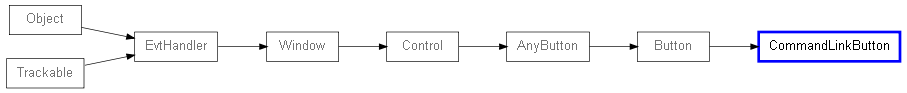
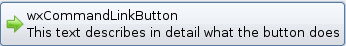
 Control Appearance