 ButtonPanel
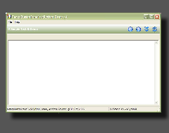
A custom panel class with gradient background shading with the possibility to add buttons and controls still respecting the gradient background.
 Methods Summary
| __init__ | Default class constructor. |
| AddButton | Adds a button to ButtonPanel. |
| AddControl | Adds a wxPython control to ButtonPanel. |
| AddSeparator | Adds a separator line to ButtonPanel. |
| AddSpacer | Adds a spacer (stretchable or fixed-size) to ButtonPanel. |
| Clear | Clears the ButtonPanel. |
| DoGetBestSize | Gets the size which best suits ButtonPanel: for a control, it would be |
| DoGiveHelp | Shows tooltips and long help strings in wx.StatusBar. |
| DoLayout | Do the Layout for ButtonPanel. |
| FlexibleLayout | Layout the items when the main caption exists. |
| GetAlignment | Returns the buttons alignment. |
| GetBPArt | Returns the associated BPArt art provider. |
| GetBarText | Returns the main caption text. |
| GetControls | Returns the wxPython controls that belongs to ButtonPanel. |
| GetItemSize | Returns the size of an item in the main ButtonPanel sizer. |
| GetNonFlexibleChildren | Returns all the ButtonPanel main sizer’s children that are not |
| GetStyle | Returns the ButtonPanel window style. |
| GetUseHelp | Returns whether or not short and long help strings should be displayed as tooltips |
| HasBarText | Returns whether ButtonPanel has a main caption text or not. |
| HitTest | HitTest method for ButtonPanel. |
| IsStandard | Returns whether ButtonPanel is aligned “Standard” (left/top) or not. |
| IsVertical | Returns whether ButtonPanel is vertically aligned or not. |
| LayoutItems | Layout the items using a different algorithms depending on the existance |
| OnEraseBackground | Handles the wx.EVT_ERASE_BACKGROUND event for ButtonPanel. |
| OnLeftDown | Handles the wx.EVT_LEFT_DOWN event for ButtonPanel. |
| OnLeftUp | Handles the wx.EVT_LEFT_UP event for ButtonPanel. |
| OnMouseEnterWindow | Handles the wx.EVT_ENTER_WINDOW event for ButtonPanel. |
| OnMouseLeave | Handles the wx.EVT_LEAVE_WINDOW event for ButtonPanel. |
| OnMouseMove | Handles the wx.EVT_MOTION event for ButtonPanel. |
| OnPaint | Handles the wx.EVT_PAINT event for ButtonPanel. |
| OnSize | Handles the wx.EVT_SIZE event for ButtonPanel. |
| OnStatusBarTimer | Handles the timer expiring to delete the long help string in wx.StatusBar. |
| ReCreateSizer | Recreates the ButtonPanel sizer accordingly to the alignment specified. |
| RemoveAllButtons | Remove all the buttons from ButtonPanel. |
| RemoveAllSeparators | Remove all the separators from ButtonPanel. |
| RemoveHelp | Removes the tooltips and statusbar help (if any) for a button. |
| RemoveText | Removes the main caption text. |
| RepaintOldSelection | Repaints the old selected/hovered button. |
| SetAlignment | Sets the buttons alignment. |
| SetBPArt | Sets a new BPArt art provider to ButtonPanel. |
| SetBarText | Sets the main caption text. |
| SetStyle | Sets the ButtonPanel window style. |
| SetUseHelp | Sets whether or not short and long help strings should be displayed as tooltips |
| SizeLayout | Layout the items when no main caption exists. |
 Class API
A custom panel class with gradient background shading with the possibility to add buttons and controls still respecting the gradient background.
Default class constructor.
| Parameters: |
|
|---|
Adds a button to ButtonPanel.
| Parameters: | btnInfo – an instance of ButtonInfo. |
|---|
Note
Remember to pass a ButtonInfo instance to this method, and not a standard wx.Button or a wx.ToolBar tool.
Adds a wxPython control to ButtonPanel.
| Parameters: |
|
|---|
Adds a separator line to ButtonPanel.
Adds a spacer (stretchable or fixed-size) to ButtonPanel.
| Parameters: |
|
|---|
Clears the ButtonPanel.
Can be used to reset the ButtonPanel if you’d like have a new set of buttons on the panel.
Gets the size which best suits ButtonPanel: for a control, it would be the minimal size which doesn’t truncate the control, for a panel - the same size as it would have after a call to Fit().
| Returns: | An instance of wx.Size. |
|---|
Note
Overridden from wx.PyPanel.
Shows tooltips and long help strings in wx.StatusBar.
| Parameters: | hit – an instance of ButtonInfo where the mouse is hovering. |
|---|
Do the Layout for ButtonPanel.
Note
Call this method every time you make a modification to the layout or to the customizable sizes of the pseudo controls.
Layout the items when the main caption exists.
| Parameters: |
|
|---|
Returns the buttons alignment.
| Returns: | An integer specifying the buttons alignment. |
|---|
See also
SetAlignment for a set of valid alignment bits.
Returns the associated BPArt art provider.
Returns the main caption text.
| Returns: | A string representing the caption text. |
|---|
Returns the wxPython controls that belongs to ButtonPanel.
| Returns: | A list of items inside ButtonPanel that are wxPython controls. |
|---|
Returns the size of an item in the main ButtonPanel sizer.
| Parameters: |
|
|---|---|
| Returns: | An instance of wx.Size. |
Returns all the ButtonPanel main sizer’s children that are not flexible spacers.
| Returns: | A list of items inside ButtonPanel that are not flexible spacers. |
|---|
Returns the ButtonPanel window style.
See also
SetStyle for a list of valid window styles.
Returns whether or not short and long help strings should be displayed as tooltips and wx.StatusBar items respectively.
| Returns: | True if the short and long help strings should be displayed as tooltips and wx.StatusBar items respectively, False otherwise. |
|---|
Returns whether ButtonPanel has a main caption text or not.
| Returns: | True if ButtonPanel has a main caption text, False otherwise. |
|---|
HitTest method for ButtonPanel.
| Parameters: | pt – the mouse position, an instance of wx.Point. |
|---|---|
| Returns: | an instance of ButtonInfo and the hit flag BP_HT_BUTTON if a button client rectangle contains the input point pt, or wx.NOT_FOUND and BP_HT_NONE. |
Returns whether ButtonPanel is aligned “Standard” (left/top) or not.
| Returns: | True if ButtonPanel is aligned “standard”, False otherwise. |
|---|
Returns whether ButtonPanel is vertically aligned or not.
| Returns: | True if ButtonPanel is vertically aligned, False otherwise. |
|---|
Layout the items using a different algorithms depending on the existance of the main caption.
Handles the wx.EVT_ERASE_BACKGROUND event for ButtonPanel.
| Parameters: | event – a wx.EraseEvent event to be processed. |
|---|
Note
This is intentionally empty to reduce flicker.
Handles the wx.EVT_LEFT_DOWN event for ButtonPanel.
| Parameters: | event – a wx.MouseEvent event to be processed. |
|---|
Handles the wx.EVT_LEFT_UP event for ButtonPanel.
| Parameters: | event – a wx.MouseEvent event to be processed. |
|---|
Handles the wx.EVT_ENTER_WINDOW event for ButtonPanel.
| Parameters: | event – a wx.MouseEvent event to be processed. |
|---|
Handles the wx.EVT_LEAVE_WINDOW event for ButtonPanel.
| Parameters: | event – a wx.MouseEvent event to be processed. |
|---|
Handles the wx.EVT_MOTION event for ButtonPanel.
| Parameters: | event – a wx.MouseEvent event to be processed. |
|---|
Handles the wx.EVT_PAINT event for ButtonPanel.
| Parameters: | event – a wx.PaintEvent event to be processed. |
|---|
Handles the wx.EVT_SIZE event for ButtonPanel.
| Parameters: | event – a wx.SizeEvent event to be processed. |
|---|
Todo
Improve the chain of methods OnSize ==> DoLayout ==> LayoutItems to avoid multiple calls to LayoutItems.
Handles the timer expiring to delete the long help string in wx.StatusBar.
Recreates the ButtonPanel sizer accordingly to the alignment specified.
| Parameters: | text (string) – the text to display as main caption. If text is set to None, the main caption will not be displayed. |
|---|
Remove all the buttons from ButtonPanel.
Note
This function is for internal use only. If you are interested in manipulating a ButtonPanel in real time (ie. removing things on it) have a look at the Clear method.
Remove all the separators from ButtonPanel.
Note
This function is for internal use only. If you are interested in manipulating a ButtonPanel in real time (ie. removing things on it) have a look at the Clear method.
Removes the tooltips and statusbar help (if any) for a button.
Removes the main caption text.
Repaints the old selected/hovered button.
Sets the buttons alignment.
| Parameters: | alignment (integer) – can be one of the following bits:
|
|---|
Sets a new BPArt art provider to ButtonPanel.
| Parameters: | art – an instance of BPArt. |
|---|
Sets the main caption text.
| Parameters: | text (string) – the main caption text label. An empty string erases the main caption text. |
|---|
Sets the ButtonPanel window style.
| Parameters: | agwStyle (integer) – one of the following bits:
|
|---|
Sets whether or not short and long help strings should be displayed as tooltips and wx.StatusBar items respectively.
| Parameters: | useHelp (bool) – True to display short and long help strings as tooltips and wx.StatusBar items respectively, False otherwise. |
|---|
Layout the items when no main caption exists.
| Parameters: |
|
|---|

 Inheritance Diagram
 Control Appearance